TRIDENT | FRAUD & RISK PLATFORM | CASE INVESTIGATION | 2025
Case Investigation: Reducing Fraud Analysis Time by 76%
Streamlining a fragmented transaction fraud investigation workspace that speeds up decision to give verdict
Overview
What is Trident?
Trident powered by Wibmo is a fraud and risk management solution for banks that detects suspicious activity on transactions, priorities alerts, & streamlines investigations.
All hands
Meet the Artists
My role
I led the end-to-end design of this platform with one other designer, owning research, product strategy, critical decision-making, visual design quality, and stakeholder alignment. I ensured high-quality, on-time shipping while mentoring junior designers across prototyping, interaction design, and visual execution.
Team
PM: Ayush Aggarwal, George Mathew, Saurabh Kumar
Design: Vishesh Raj
Eng: Shashi Gupta
Duration
JUL’ 25 - AUG’25
(4-5 weeks)
Summary - Quick glance (2 mins read)
Problem
Fraud analysts at tier-1 banks were spending 60% of investigation time hunting for information instead of making decisions, causing missed SLAs and rising backlogs
Business Impact
Delayed fraud verdicts cost banks $2.3M annually in potential losses; 39% of priority cases missed closure deadlines
Approach & Action
Analysed 70+ real fraud cases, interviewed 12 analysts across 5 banks, and redesigned the investigation workspace using a modular "signal-first" architecture
Impacts - Making a difference across the board.
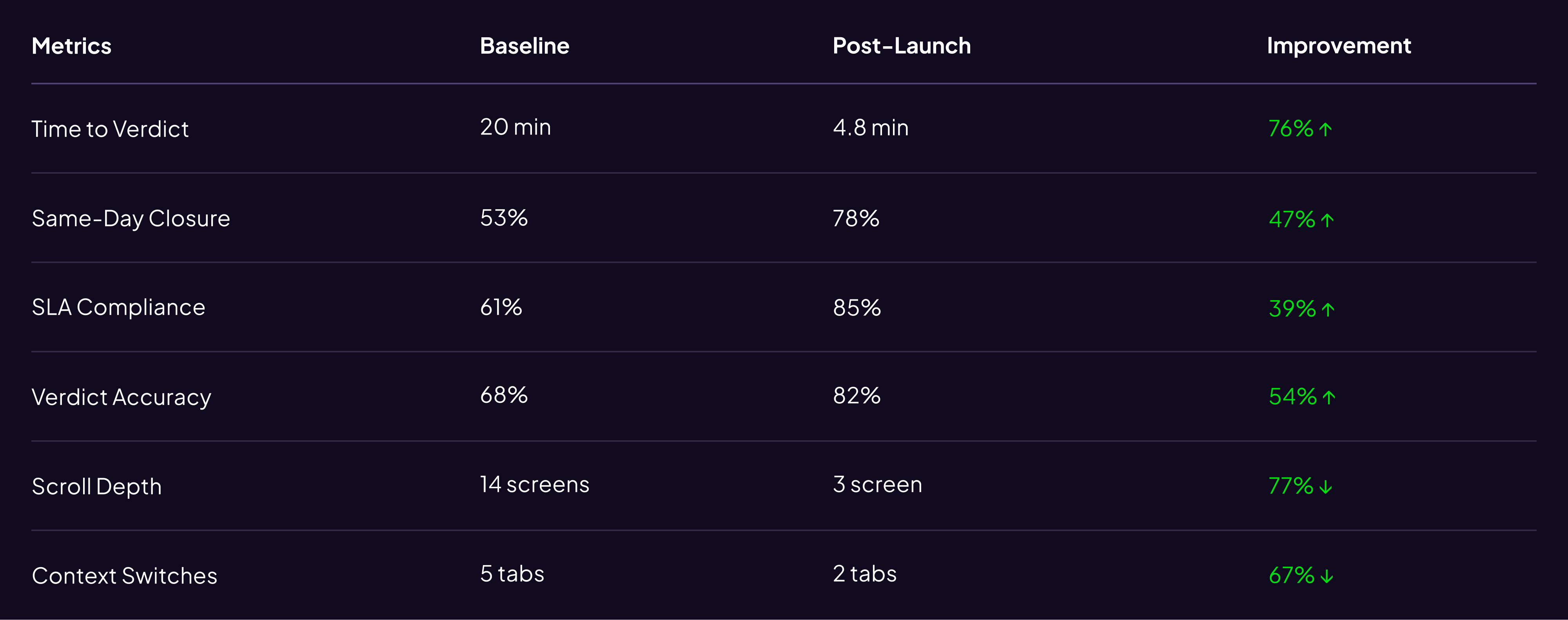
76%
Decrement in time to verdict
47%
Increment in case closed without rework within 24–48 hrs
39%
Dec. in missing deadlines for priority case closures
54%
Inc. in accuracy of risk suggestion wrt verdict
Detailed problem space
Despite best-in-class detection (40% better precision than competitors)
It simply shows that something isn’t going well with our case investigation module & needs an urgent fix.
Why this mattered
Constraint: 3-week timeline → Rapid, focused research leveraging existing data
Customer Impact
Delayed investigations meant legitimate customers blocked, fraudsters escaped
Business Cost
Verdict delays drove ~$180 losses + operational
overhead
Competitive Risk
Banks risked churn over unusable tools
Team Pressure
Rising 120 open cases per person, 18% backlog growth, 30 min average per case
Research Approach
Case Study Analysis
Analyzed 70 real fraud cases across use types
Analytics Deep-Dive
Heatmaps, scroll depth, time-on-task (90 days)
Contextual Interviews
Shadowed 12 analysts × 5 banks (2 hrs each)
Competitive Audit
4 competitor platforms + 6 internal tools
Discovery
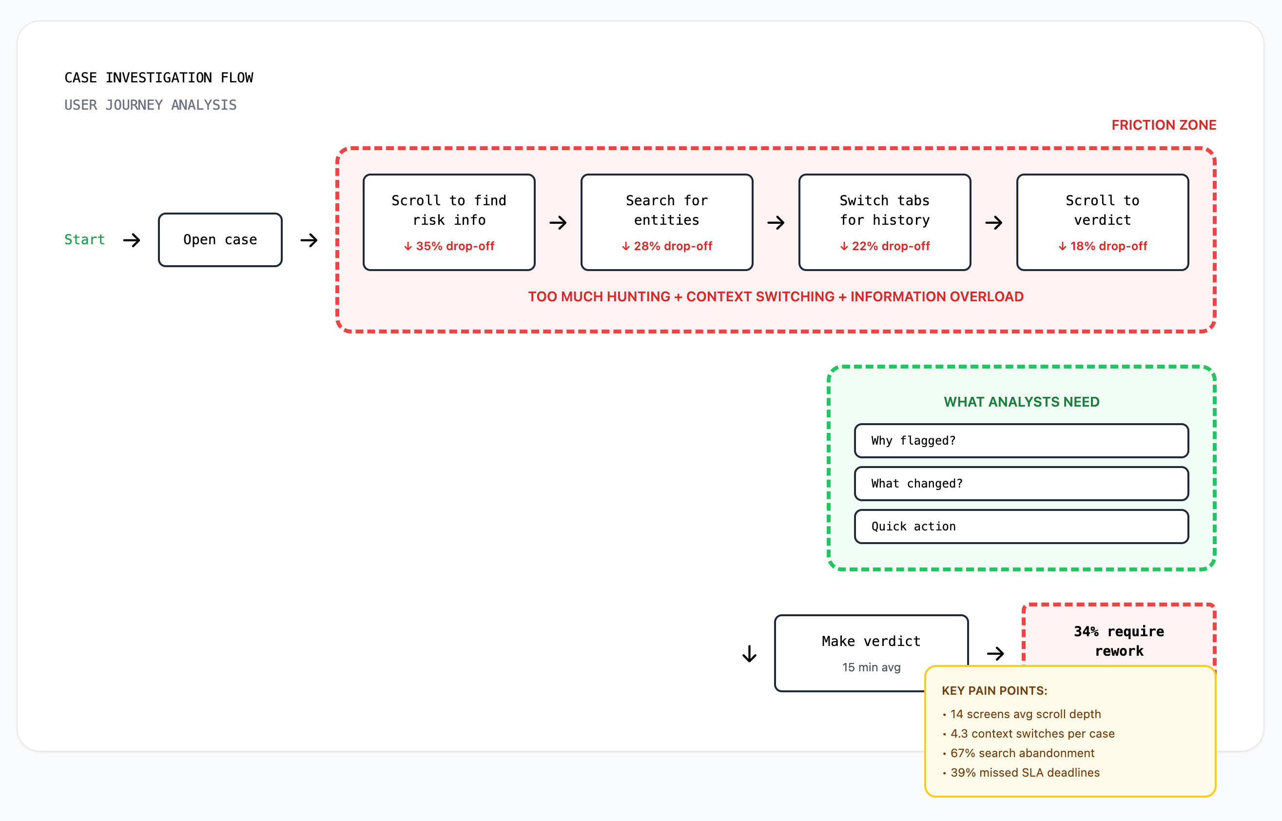
Let’s start from what we had
Data observed from platform analytics & escalations,
- 39% of high-priority cases missed SLA deadlines
- Analysts scrolled an average of 14 screens per case
- 34% of verdicts required rework due to missed context
- Search function had 67% abandonment rate
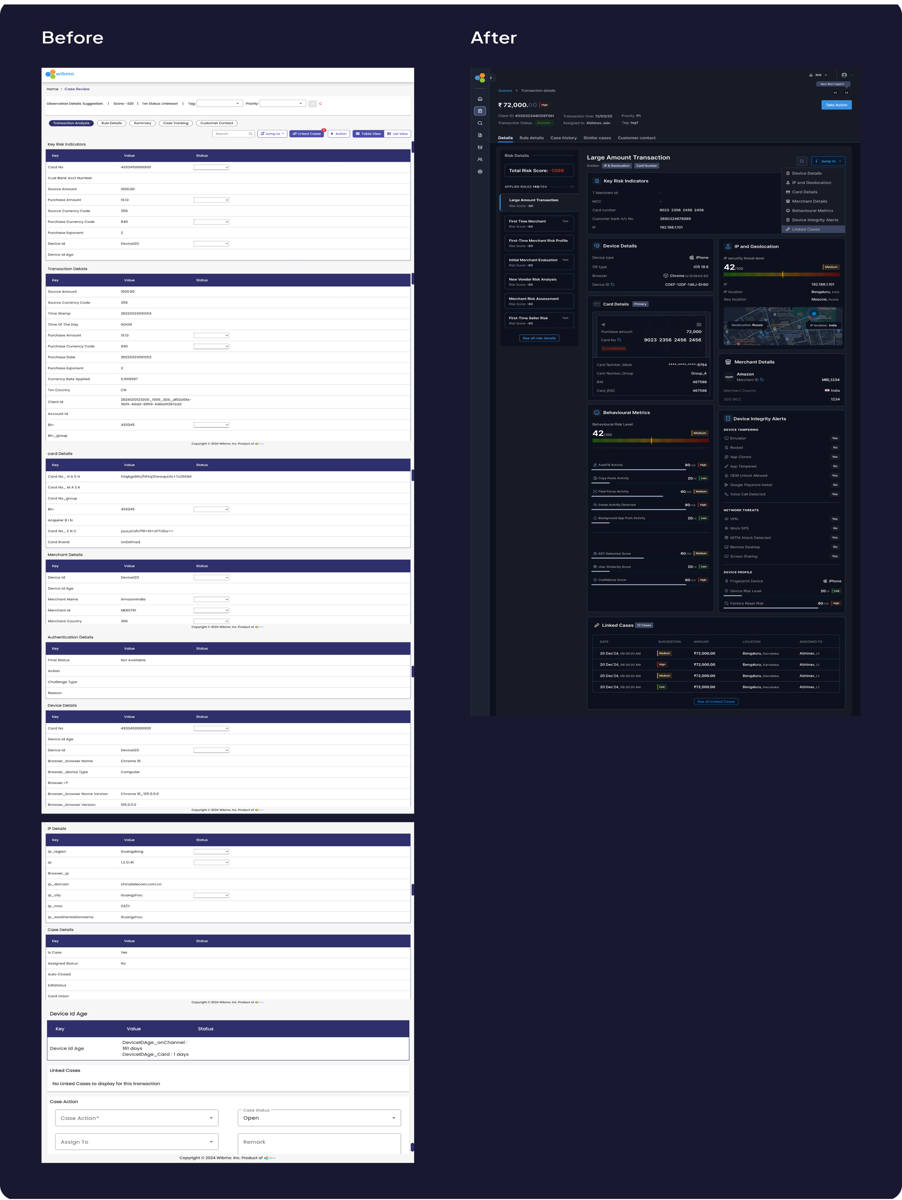
Current flow
Zoom into the flow & you will see the obvious problems like

- Too much scrollable info.
- Poor Information Architecture
- Absence of behavioural informations


Hypothesis
From earlier funnel analysis it was too much effort was required by analysts to make fraud decisions.
When investigating flagged transactions, analysts spent 60% of time hunting for information instead of making decisions.
Key insights - User interviews
What we observed from the users
Information Architecture was inverted
Analysts needed 'why flagged?' first, but buried 8-12 scrolls deep, 83% used Cmd+F to search instead of scanning
"I spend more time finding the evidence than judging it" - Risk Analyst,HDFC Bank
No behavioral context = guesswork
Platform showed facts (amount, location) not anomalies (vs. normal behavior), 40% of investigation time spent manually comparing history
"I need to know what changed since last time"
Scattered evidence across disconnections
Entity relationships (linked cards, IPs, devices) existed but not surfaced, 4-5 tabs opened simultaneously to cross-reference
“No unified timeline showing event sequence"

Persona
One analyst summed it up perfectly


“Meet Rajeshwari, a risk analyst at **** bank, At 10:20 A.M opens Case #204592: a high‑value, cross-border wire transfer flagged by 8 rules due to a card txn. happened from a different IP. She has 120 open cases, a backlog rising by 18%, and just 10 minutes per case.
- “I spend more time finding the evidence than judging it.”
- “I need to know what changed since last time this customer transacted.”
- “These rules are listed, but I can’t tell which actually tipped the scale.”
Decision needed:
• Legitimate customer traveling?
• Account takeover?
Daily workload
• 120 open cases, 10 min per case target
Success for her meant:
Clear confidence in verdict without needing to cross-check 5 tools.

“20 minutes of hunting → 3 minutes of actual decision-making.”
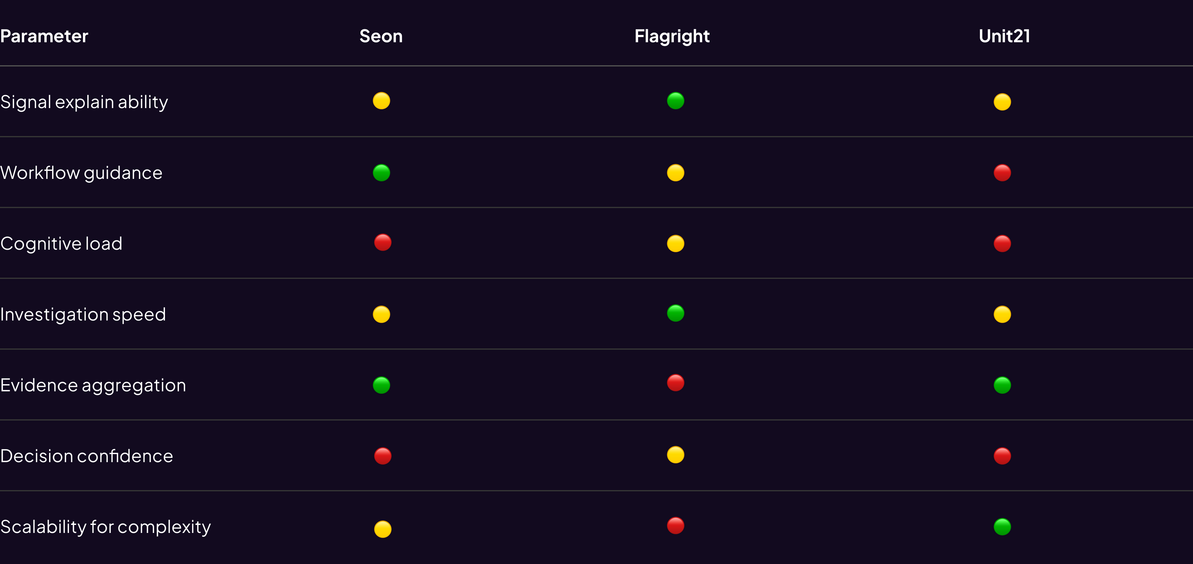
Competitive research
Goal: Understand how best-in-class investigation tools structure decision-making under uncertainty.
Insight Synthesis:
- High-performing fraud platforms don’t optimize for data access — they optimize for decision confidence.
- This re framed our goal from “show everything” to “surface what matters.”
Competitive matrix
Success metrics
How We'd Measure Success (3 Layers)
Business metrics
- Time-to-verdict (baseline: 15 min)
- Same-day closure rate (baseline: 53%)
- SLA compliance (baseline: 61%)
User efficiency
- Scroll depth per investigation
- Context switches (tabs/tools)
- Search query success rate
Quality metrics
- Verdict accuracy vs. outcomes
- Rework rate due to missed info
Target: 40%+ improvement in time-to-verdict and SLA compliance within 90 days post-launch (50 analysts, 3 pilot banks)
Key Constraints
Business
- 3-week hard deadline (2 banks threatening churn by Sept 1)
- Couldn't delay ongoing AI features roadmap
User
- High-stress environment – no added cognitive overhead
- Custom workflows per bank – needed configurability
Technical
- Legacy backend (Java 8, monolithic) – no new API endpoints
- Only 12 existing endpoints available
- Design system in transition (bridge old/new components)
Design hook
So how did we solved it?
We analysed 60-70 cases to understand different use-cases and kind of information an analyst looks for while investigating cases
Opted the SLICE approach - i.e piece by piece solving the problem

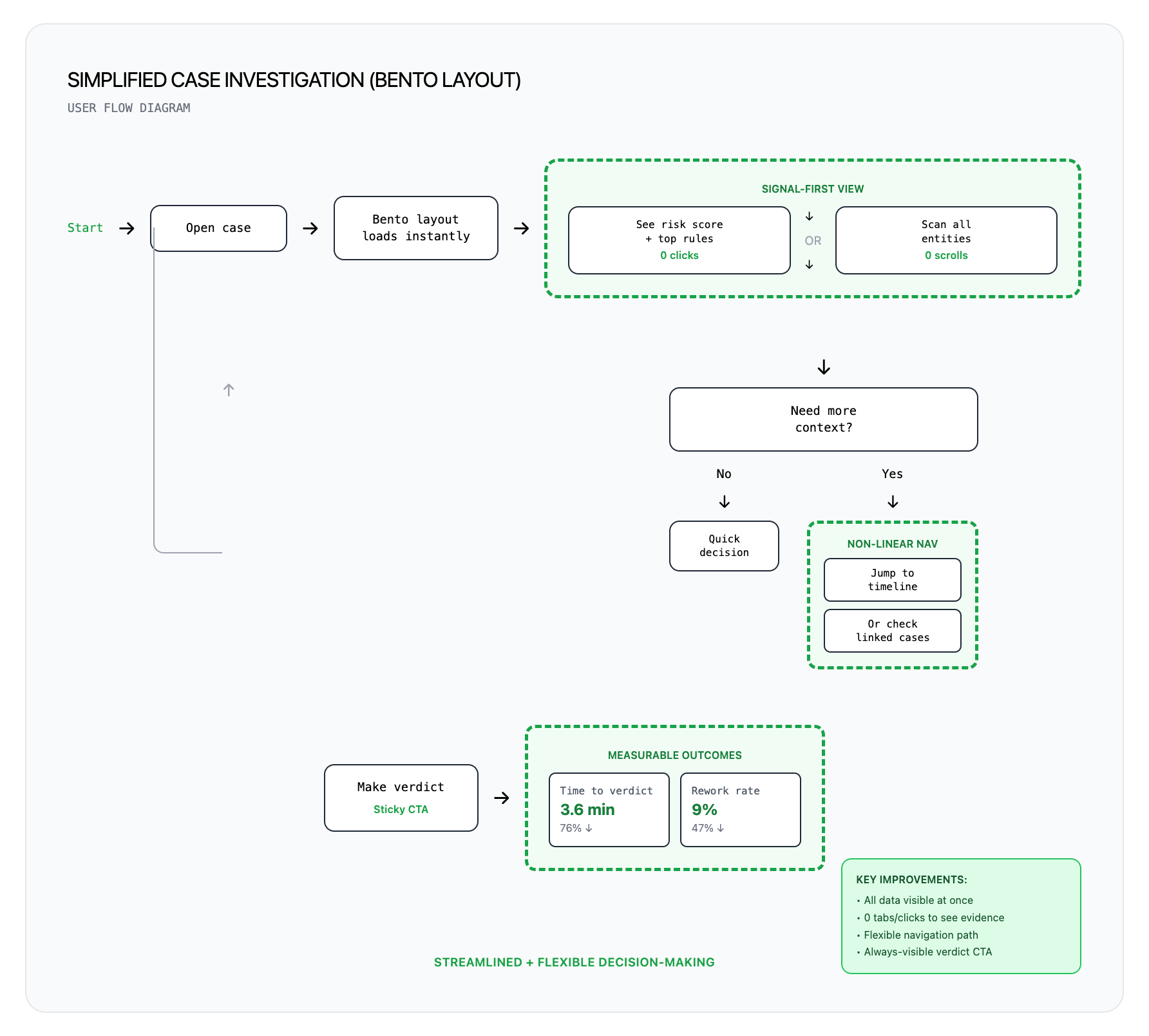
Streamlined User flow
But First it was important to simplify the existing user flow with right set of expectations
Ideation & Wireframe
Key Decision & Tradeoffs
Decision 1 : Bento layout over tabbed & screen split layouts
To understand better we iterated on multiple layouts using Figma make and tested it with internal risk users in collaborations with Product & tech team an finalised Bento over others
Other Considerations:
Screen split layout
Tabs based interface
Why Bento Mattered ✅
✓ Speed: The analysts gets to know“what changed,” and SLA in under 10 seconds from the cards
✓ Non-linear navigation, jump based on case type
✓ Each card = independent component, no back end changes
✓ Micro-metrics on each card: time-to-first-view, click-through, expansion rate is easy to track thus the layout is measurable and modular
What we sacrificed ❌
✗ Higher initial cognitive load → Mitigated: Quick-jump nav + shortcuts
✗ Lost hand-holding for junior analysts → Acceptable: 80% are senior (3+ yrs)
Validation: Lo-fi prototype tested with 5 analysts → 4/5 preferred bento for speed. Chose to optimize for power users.
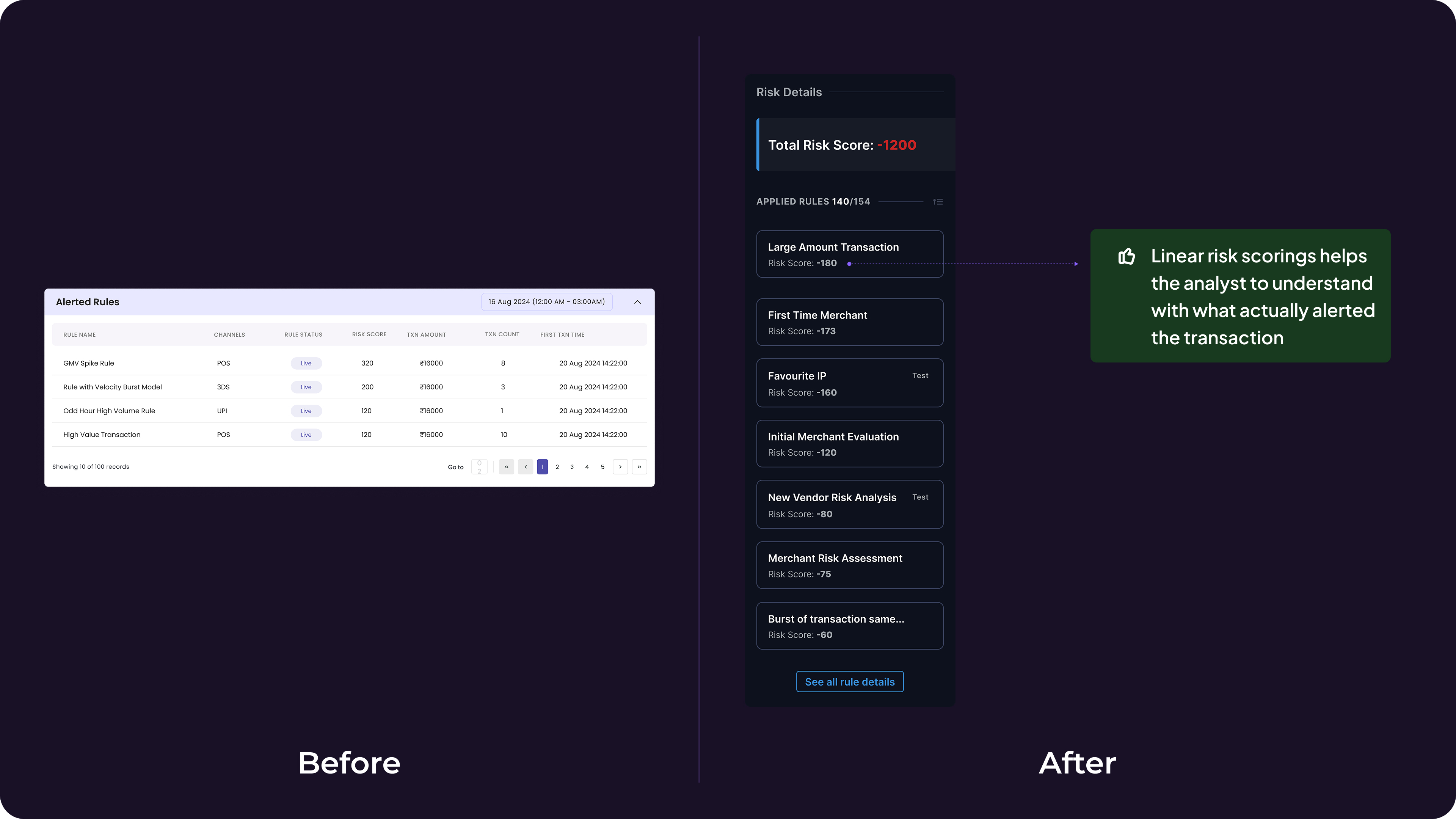
Decision 2: Risk Score Hierarchy Over Flat Rule List
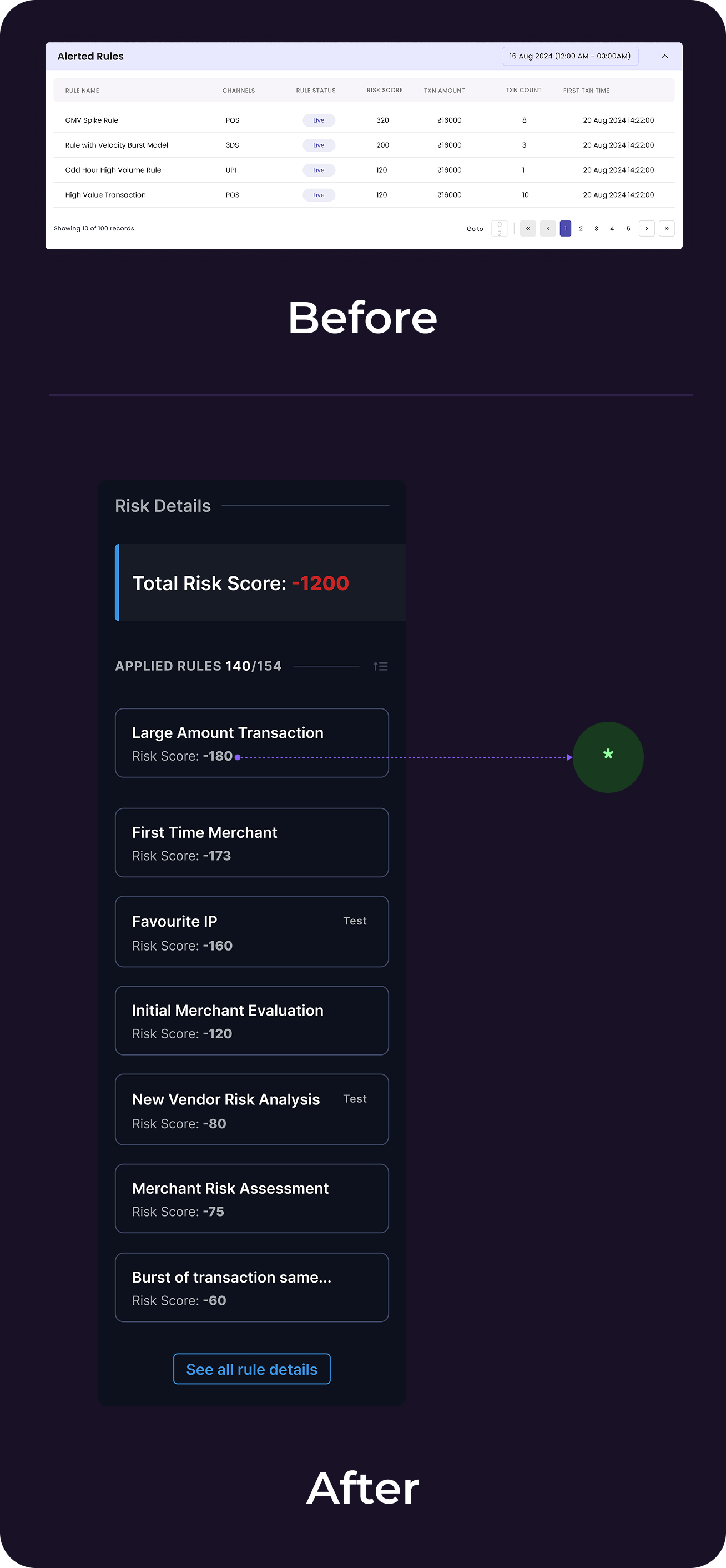
The Problem: 4-8 rules triggered but all displayed equally → analysts evaluated all 8.
*Solution: Sort rules by risk score (descending) + show visual distribution of which rules tipped the alert threshold.
Why it mattered ✅
✓ Analysts immediately see "Rule #3 contributed 65% of total risk score" → focus there first
✓ Reduced cognitive load from evaluating 8 rules to focusing on top 2-3
✓ Low-confidence rule = dig deeper; high-confidence = quick action
What we sacrificed ❌
✗ Required backend to expose risk scores per rule (not previously available). Negotiated with Engineering to add this to existing endpoint response within Week 2.
Impact: Evaluation scope reduced from ~8 rules → 2–3
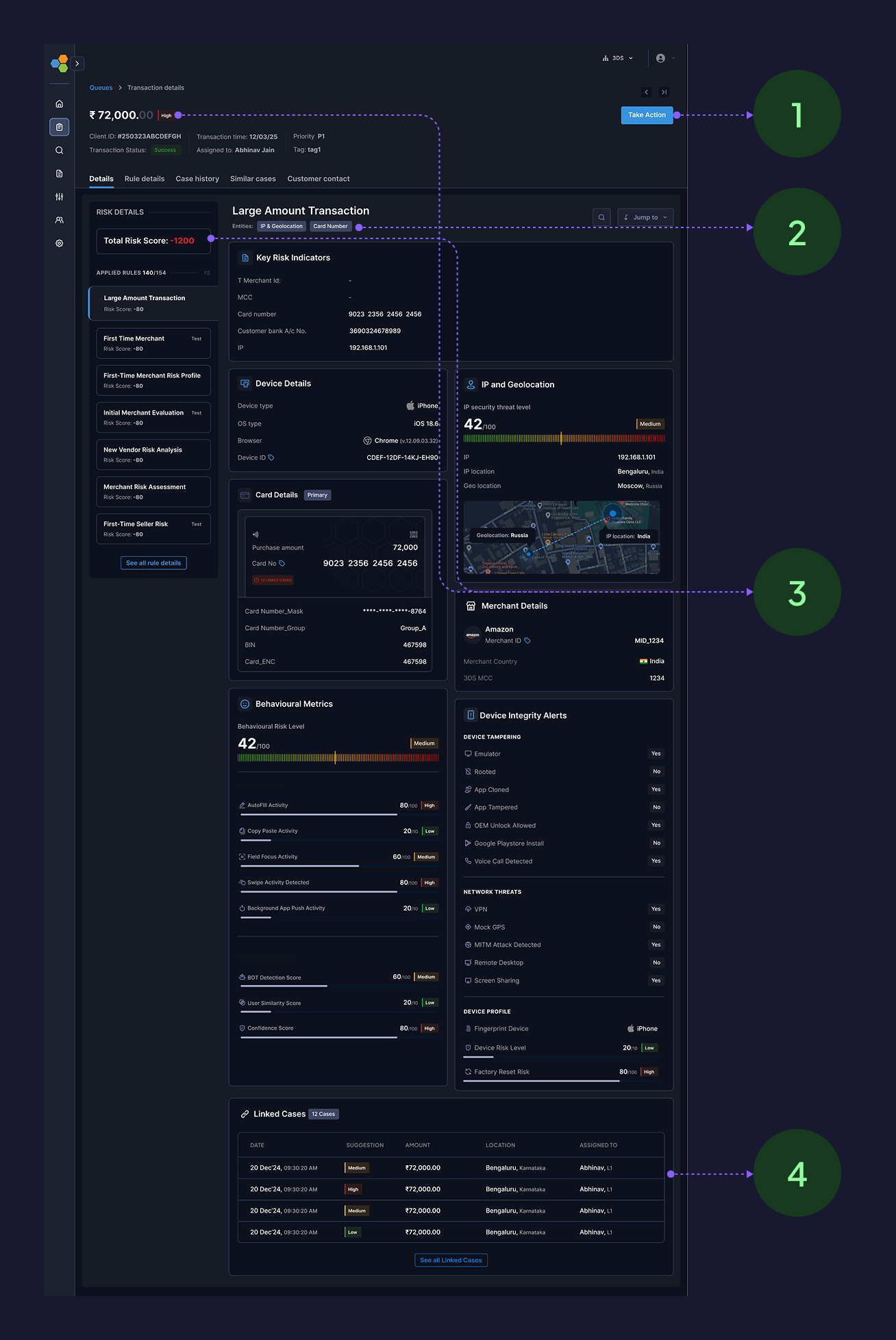
Detailed solution breakdown
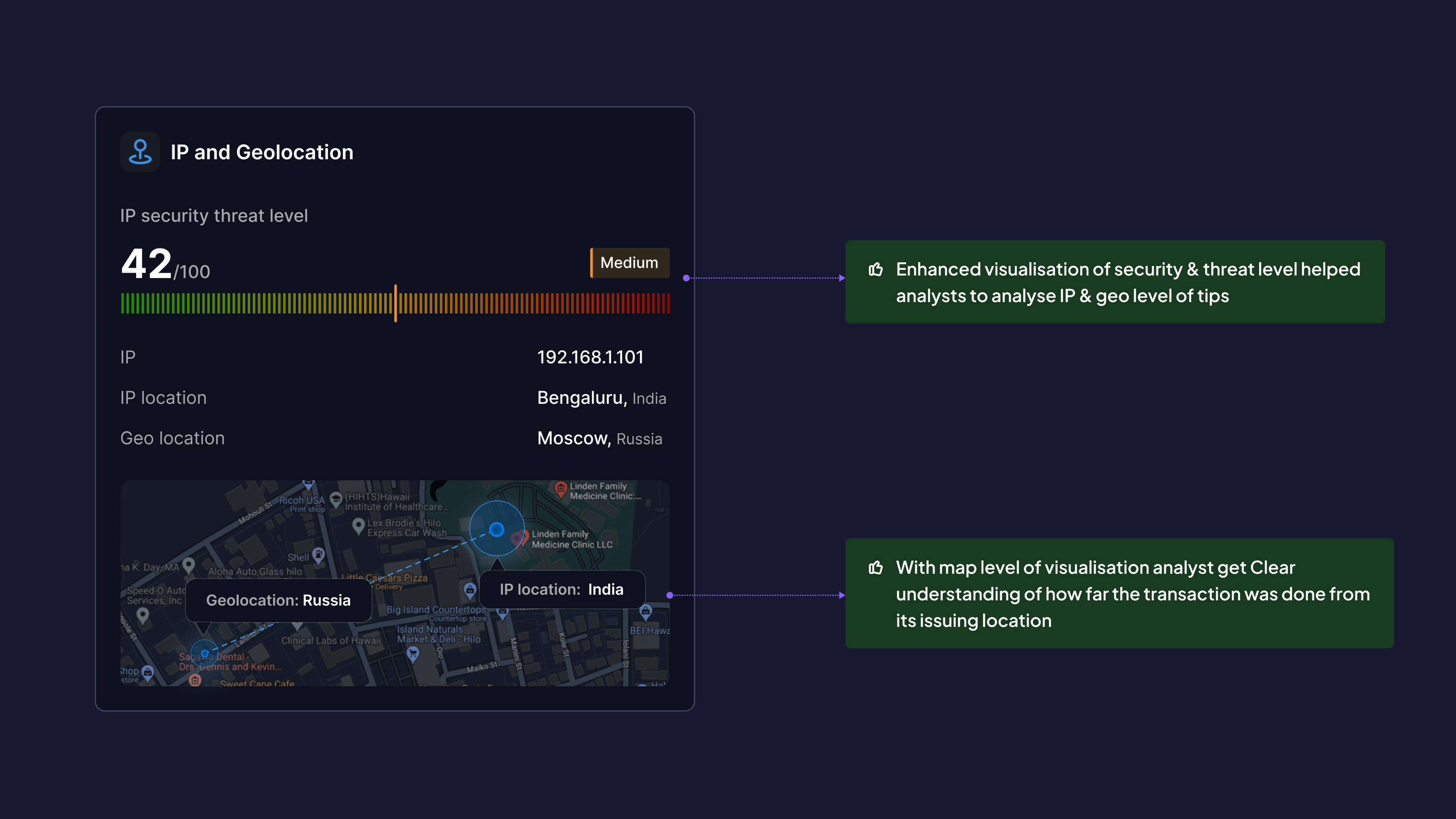
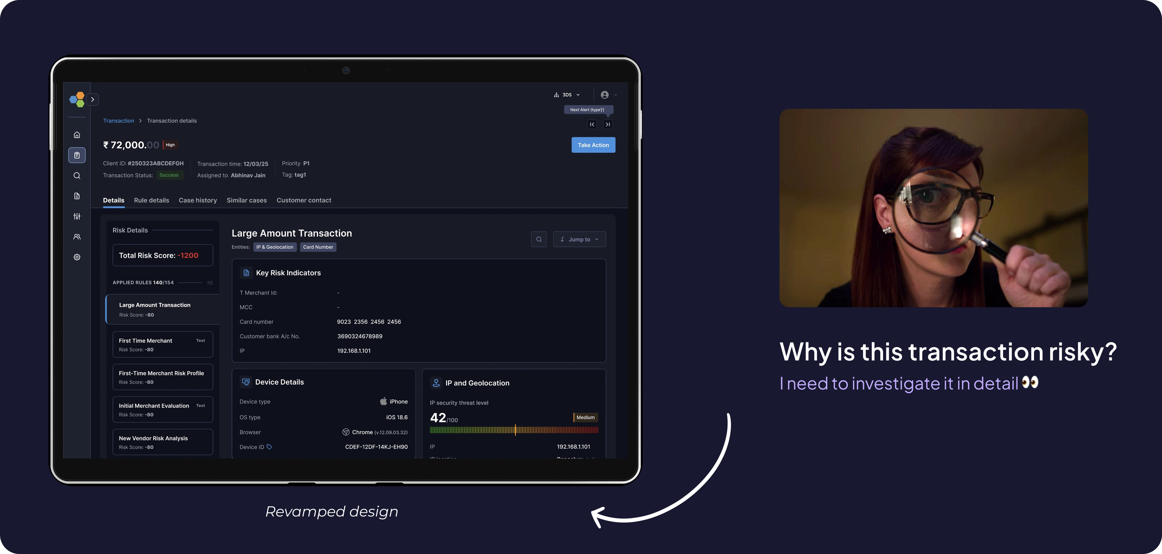
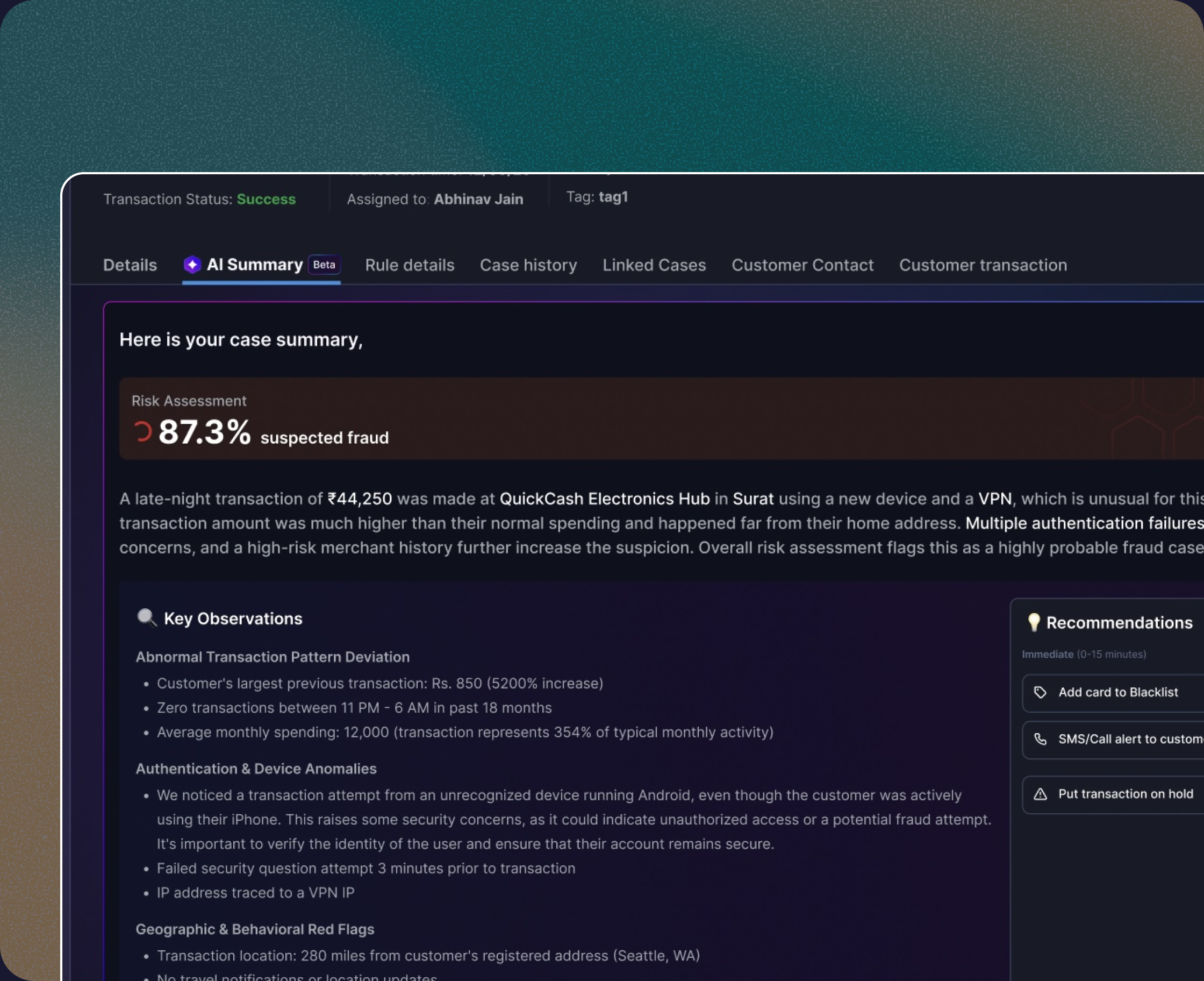
Decision 3: Solving the IP & Geolocation threats
Before:
Raw IP address + city
After:
- Threat level indicator (Low/Medium/High/Critical) based on IP reputation databases
- Distance from issuing location (e.g., "4,200 km from cardholders home")
- Map visualization showing transaction location vs. historical pattern
- Proxy/VPN detection flag
Why This Matters:
- Analysts instantly assess: "Is this cardholder traveling or is this account takeover?"
- Reduced false positives (legitimate travel) by 31%
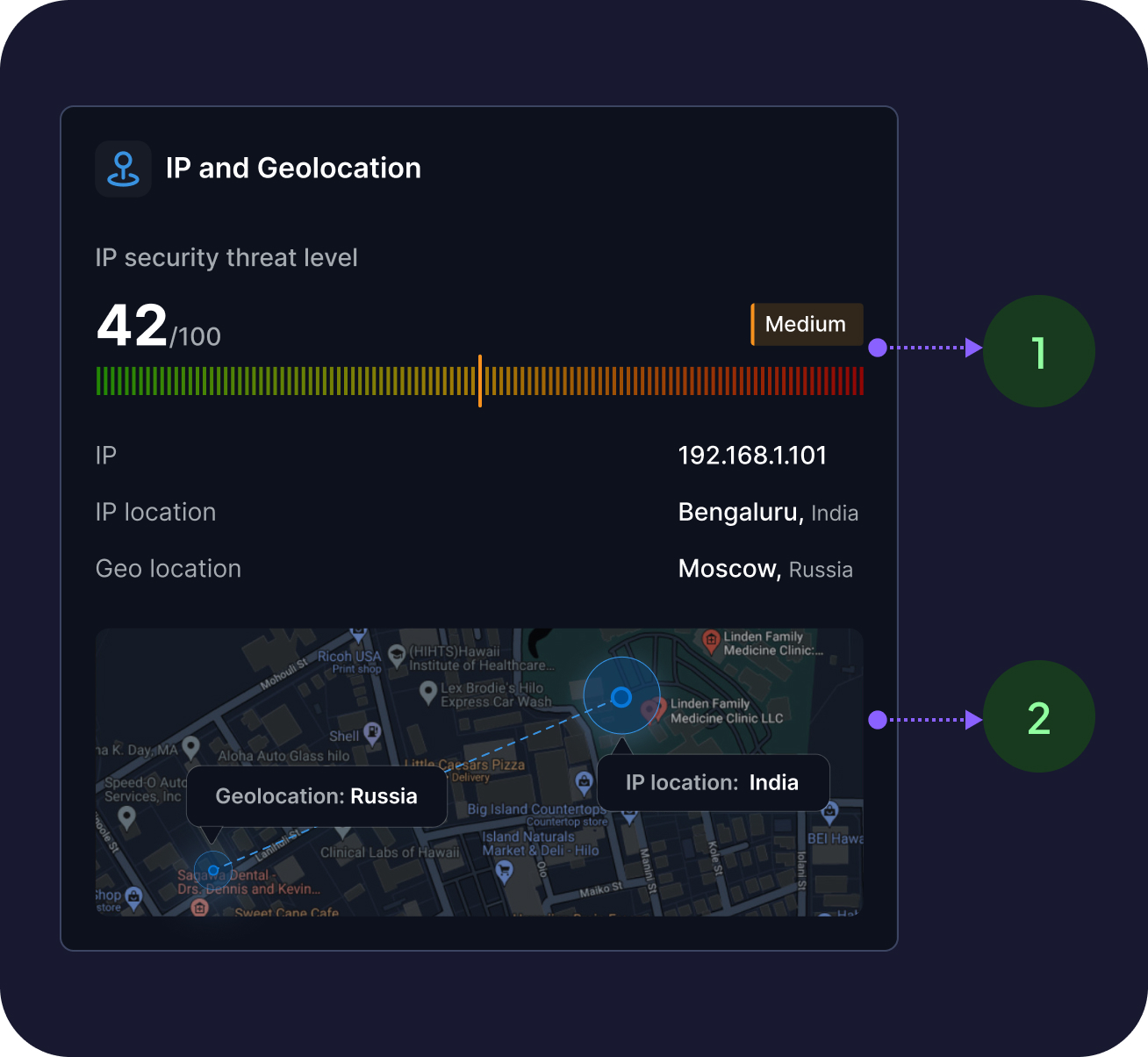
- Enhanced visualisation of security & threat level helped analysts to analyse IP & geo level of tips
- With map level of visualisation analyst get Clear understanding of how far the transaction was done from its issuing location
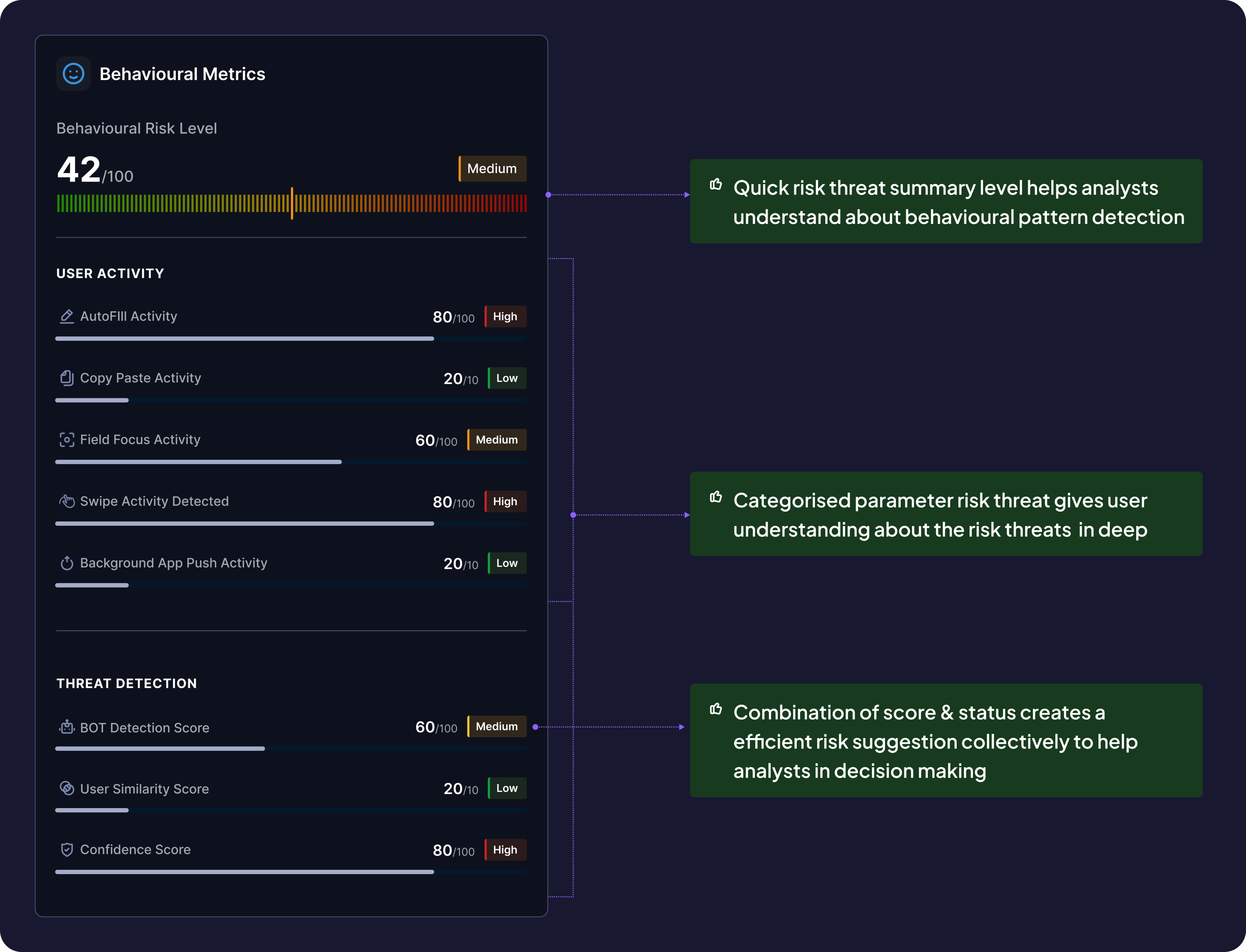
Decision 4: Adding the behavioural information
New Addition (didn't exist before):
- Bot activity detection (e.g., "Form filled in 0.8 seconds — likely automated")
- OTP behavior (autofill vs. manual entry)
- Session anomalies (rapid clicks, unusual timing)
- Biometric signals (when available)
Why This Matters:
- Differentiated human behavior from bot attacks
- Improved accuracy of card-not-present fraud detection by 54%
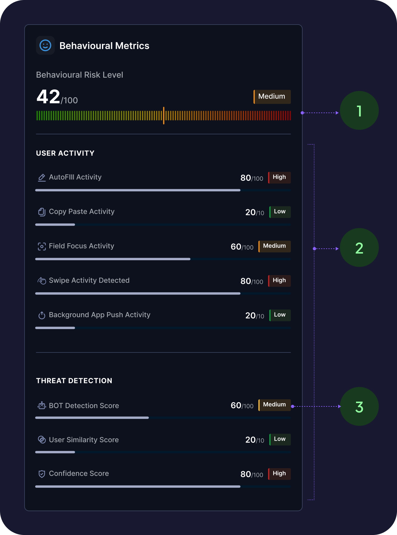
- Quick risk threat summary level helps analysts understand about behavioural pattern detection
- Categorised parameter risk threat gives user understanding about the risk threats in deep
- Combination of score & status creates a efficient risk suggestion collectively to help analysts in decision making
Decision 5: Structuring informational complexities
Before:
Long scrollable list, equal weight
After:
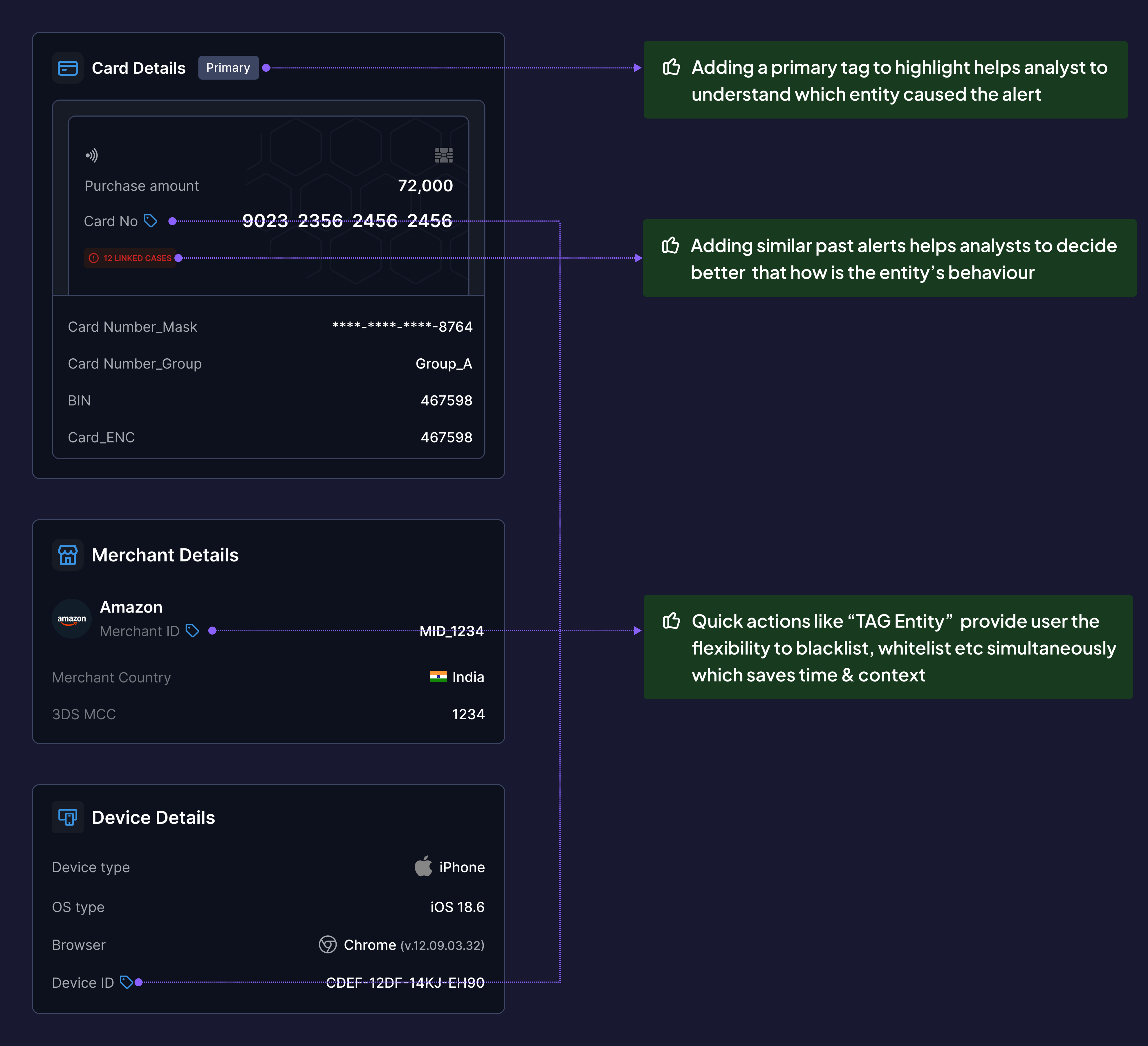
- Primary entity flagged with "PRIMARY" tag (the entity that triggered the alert)
- Similar past alerts summarized (e.g., "This card flagged 3x in last 30 days")
- Inline actions: Tag Entity (blacklist/whitelist), Block, Escalate
- Linked entities visible (e.g., "2 other accounts share this device fingerprint")
Why This Matters:
- Analysts focus on the entity that matters first
- Inline actions reduce context switching (don't need separate "Actions" page)
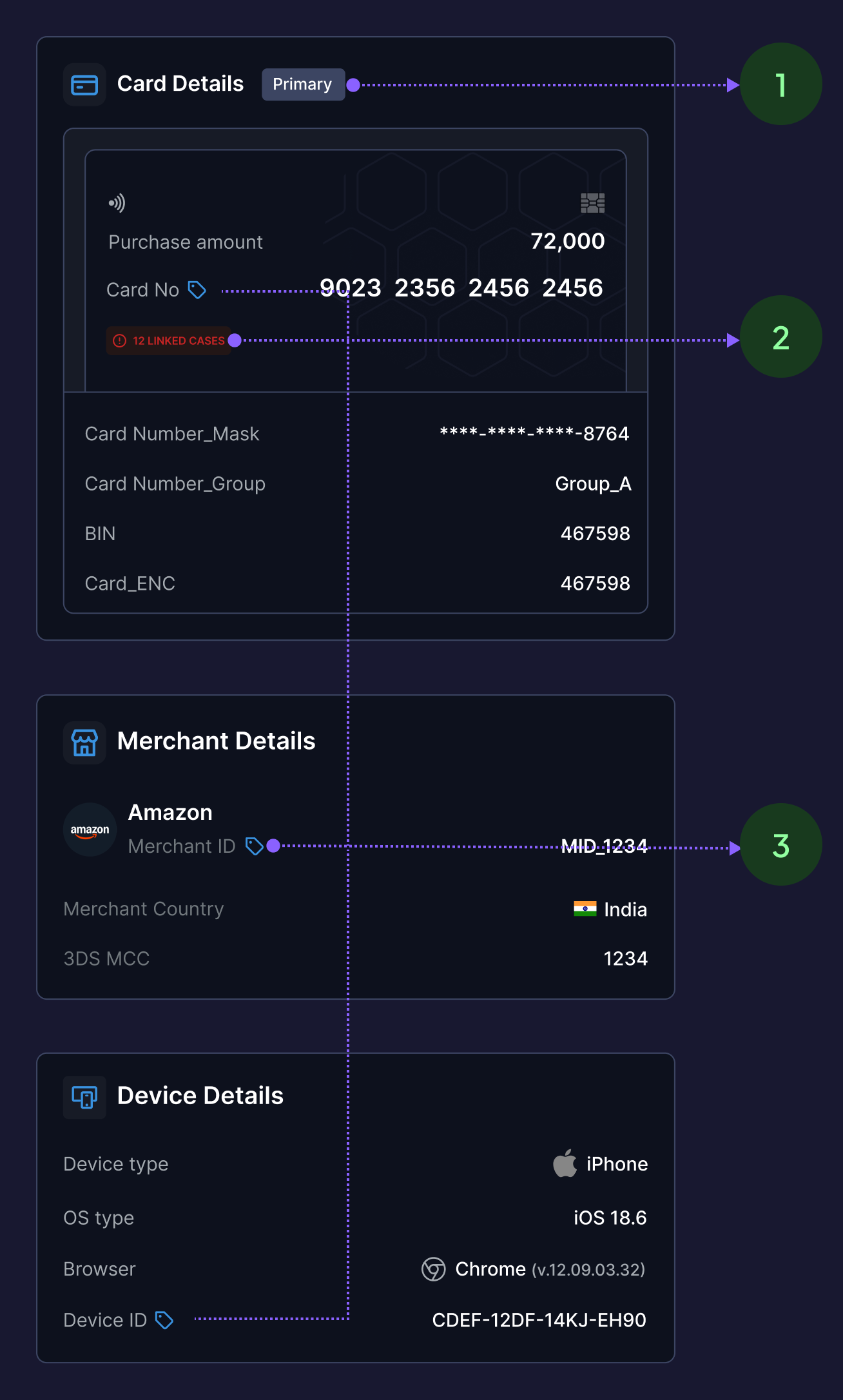
- Adding a primary tag to highlight helps analyst to understand which entity caused the alert
- Adding similar past alerts helps analysts to decide better that how is the entity’s behaviour
- Quick actions like “TAG Entity” provide user the flexibility to blacklist, whitelist etc simultaneously which saves time & context
Detailed solution breakdown
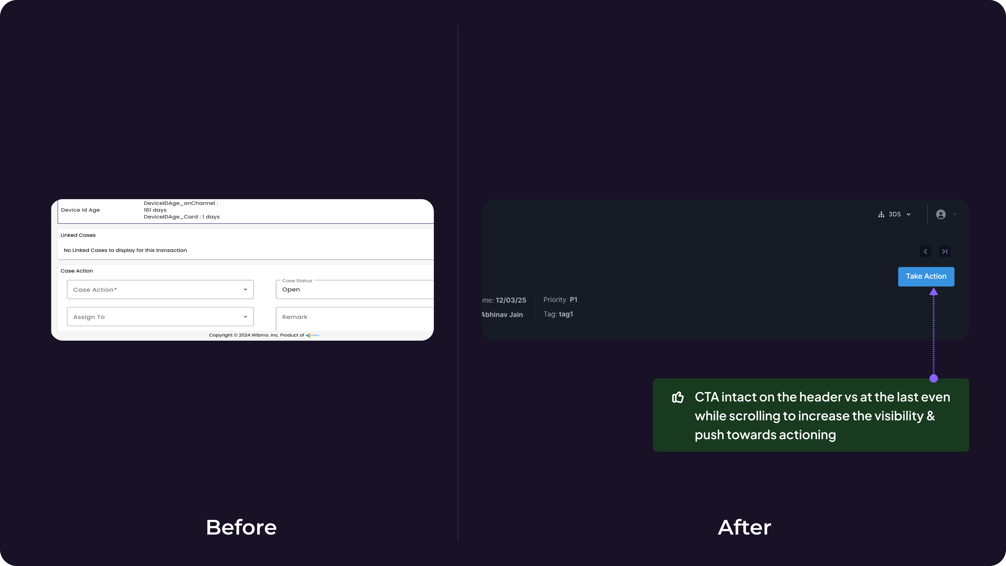
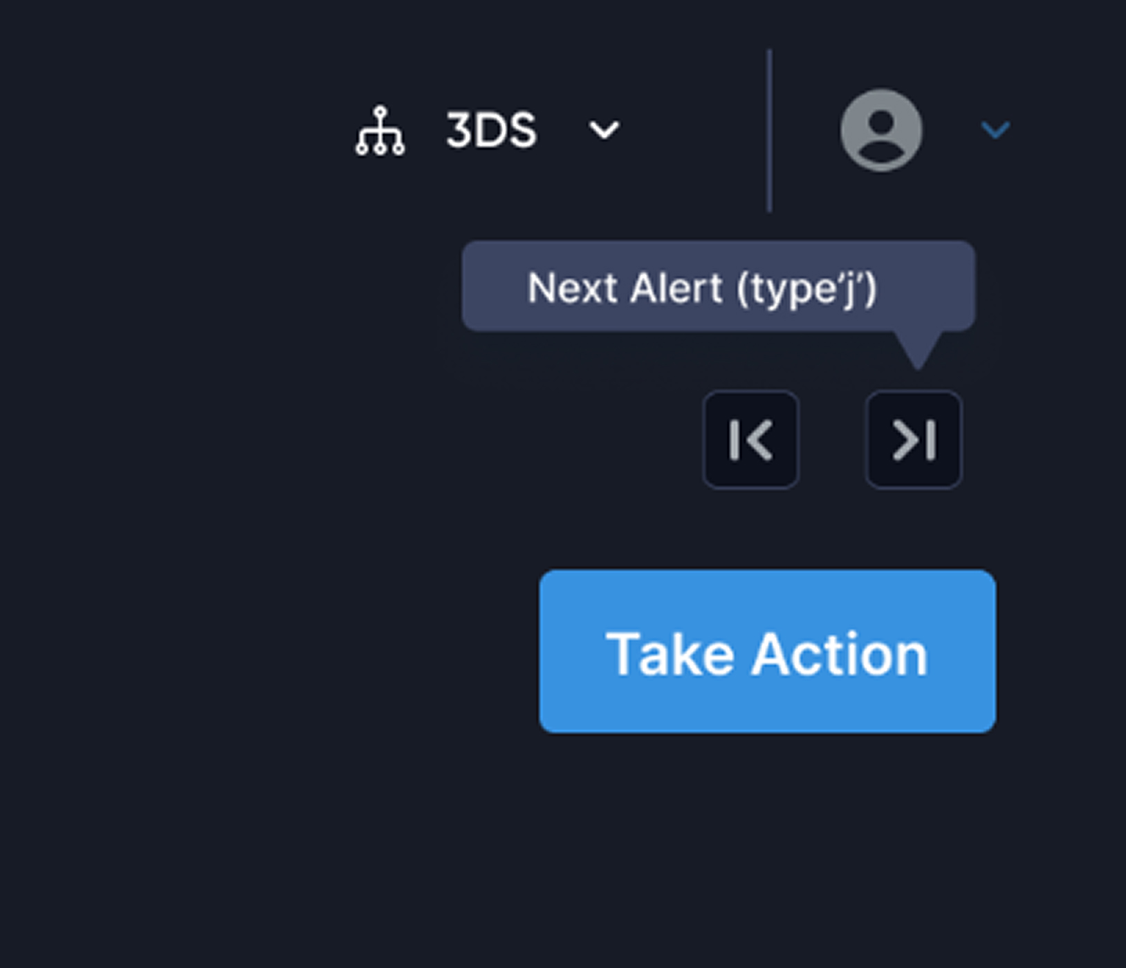
Decision 6: Sticky Header Verdict Controls over Bottom Placement
Problem:
Primary action ("Submit Verdict") was at the end of a 14-screen scroll → lost context by the time analysts reached it.
Options Considered:
- Sticky header CTA (always visible)
- Floating action button (FAB)
- Bottom placement with anchor link
- Sticky sidebar
Why This Matters:
- Analysts instantly assess: "Is this cardholder traveling or is this account takeover?"
- Reduced false positives (legitimate travel) by 31%
Validation:
- Heatmap data post-launch showed 89% of analysts completed verdict within first 3 cards vs. scrolling to bottom.
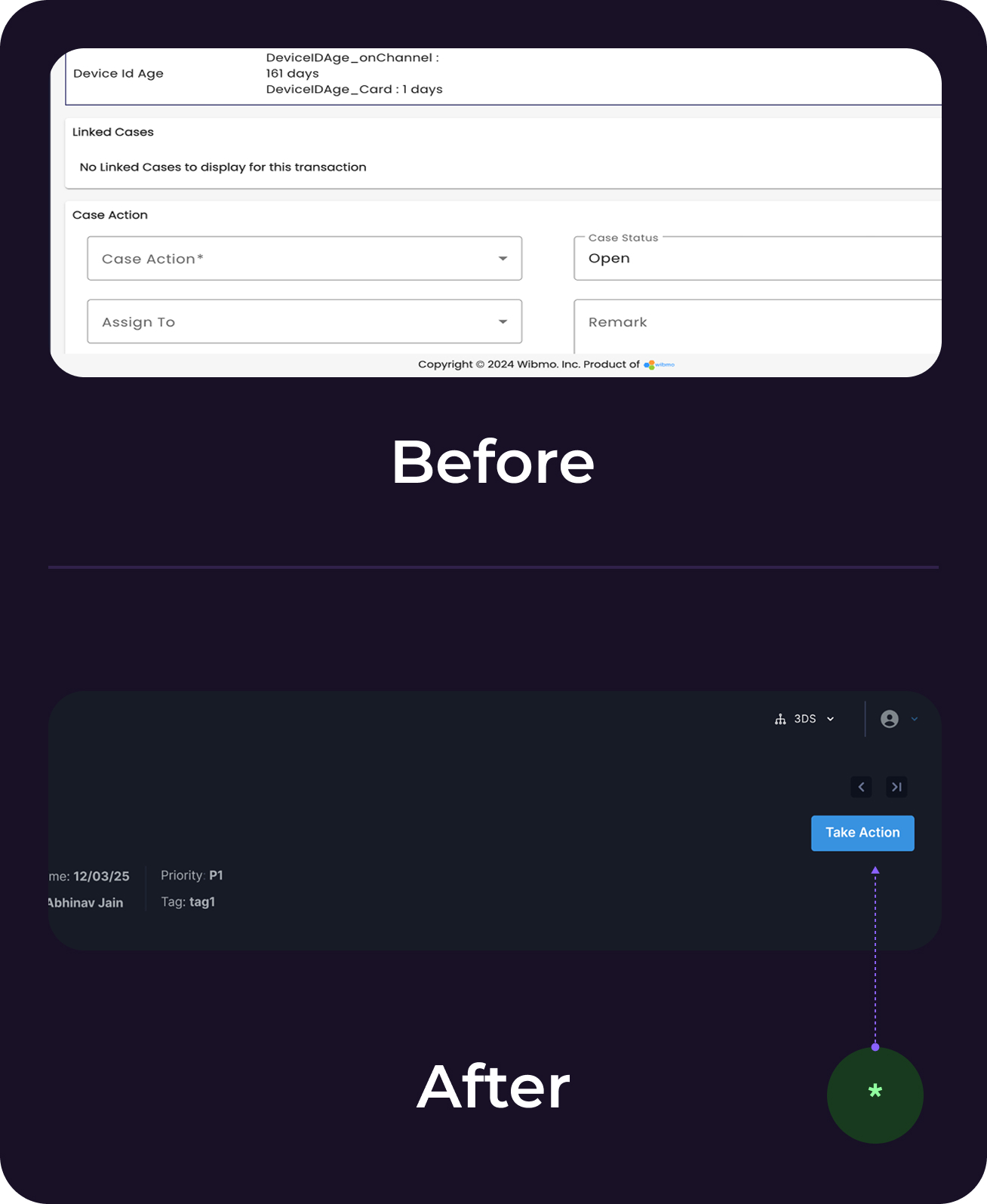
* CTA intact on the header vs at the last even while scrolling to increase the visibility & push towards action
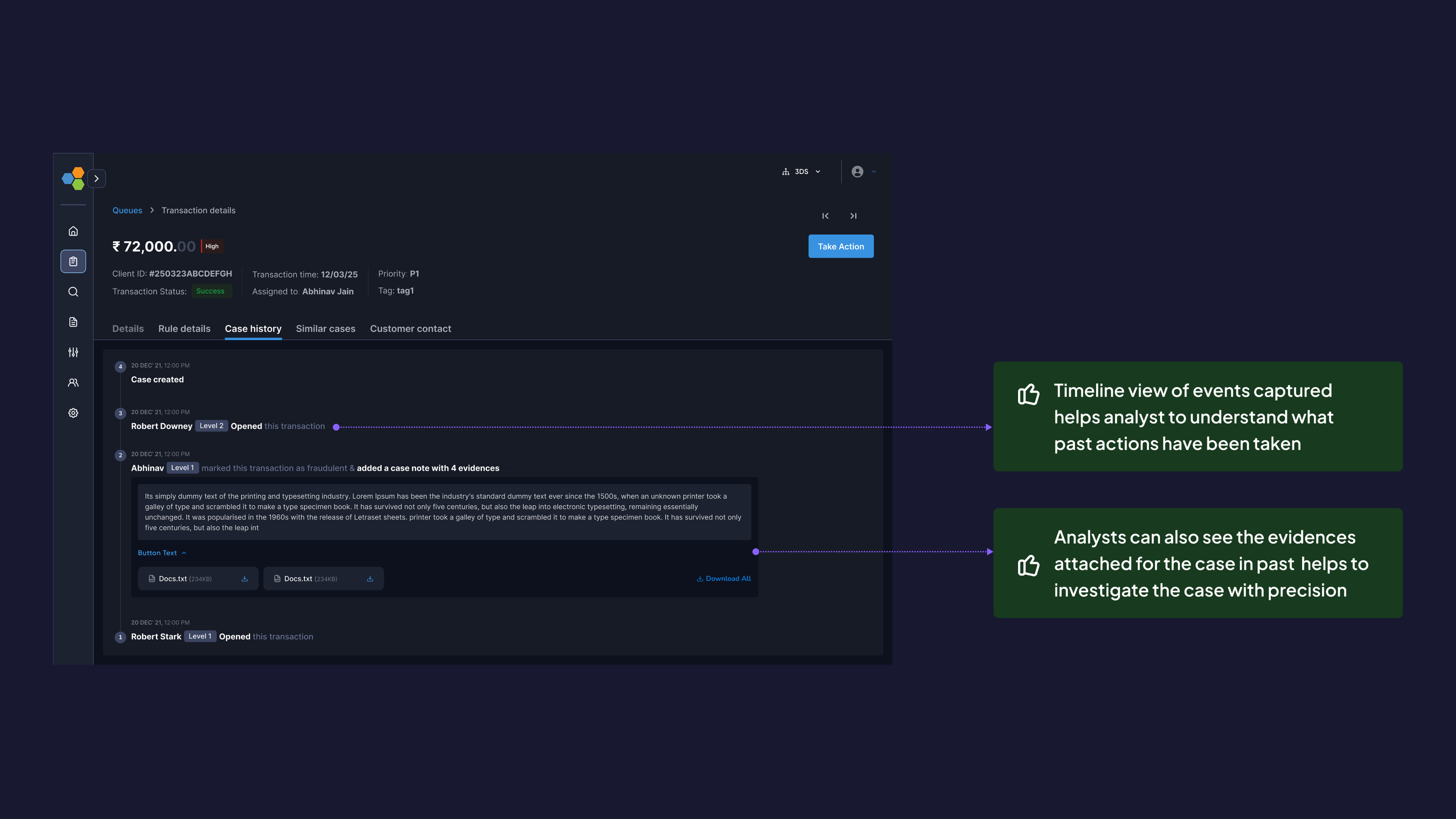
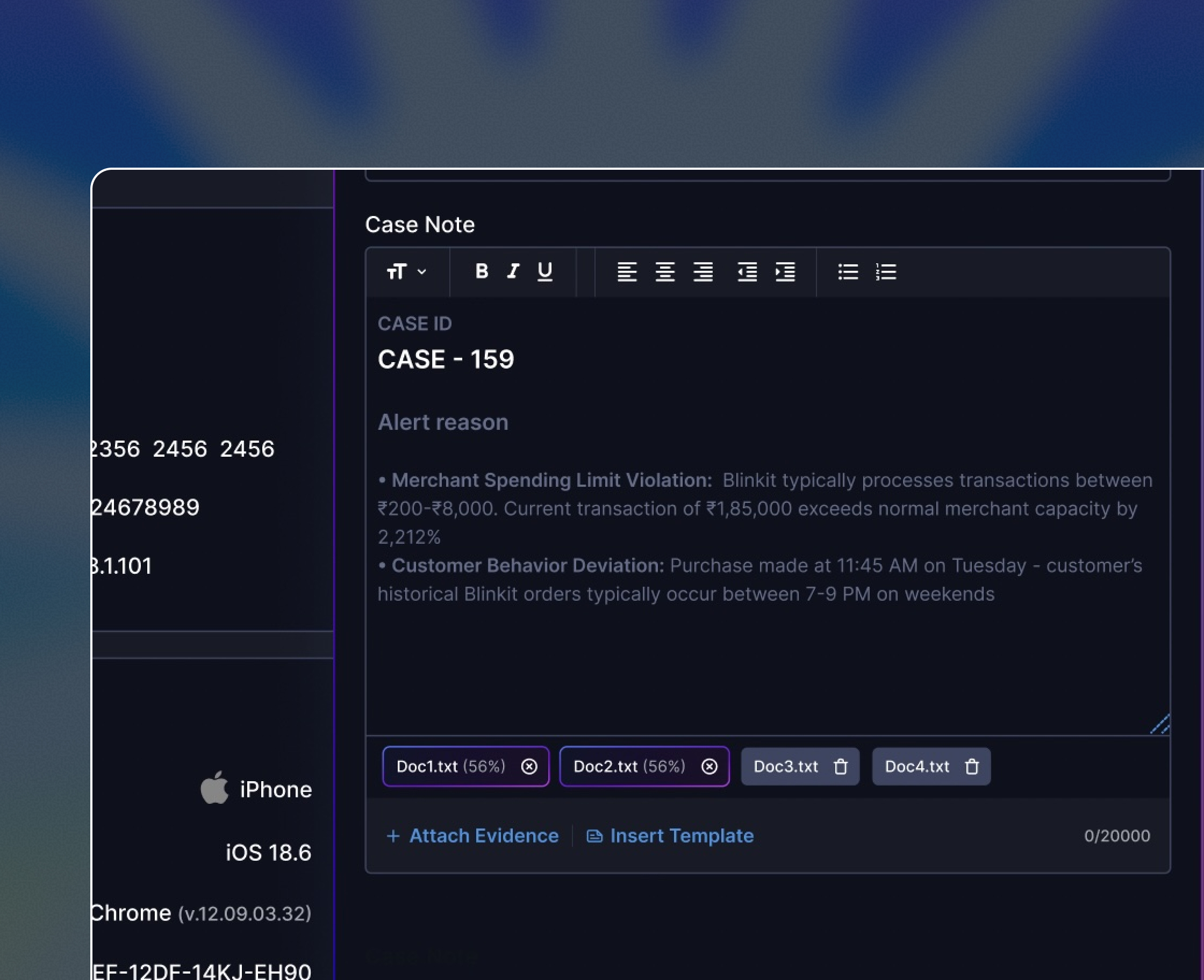
Decision 7: Timeline view of events
New Addition (didn't exist before):
- Chronological event log: rule triggers, analyst actions, system responses
- Attached evidence (screenshots, notes) visible inline
- Color-coded by event type (user action, system alert, external API call)
Why This Matters:
- Analysts understand causality: "User changed password → 10 min later → high-value transfer"
- Critical for escalations and audits
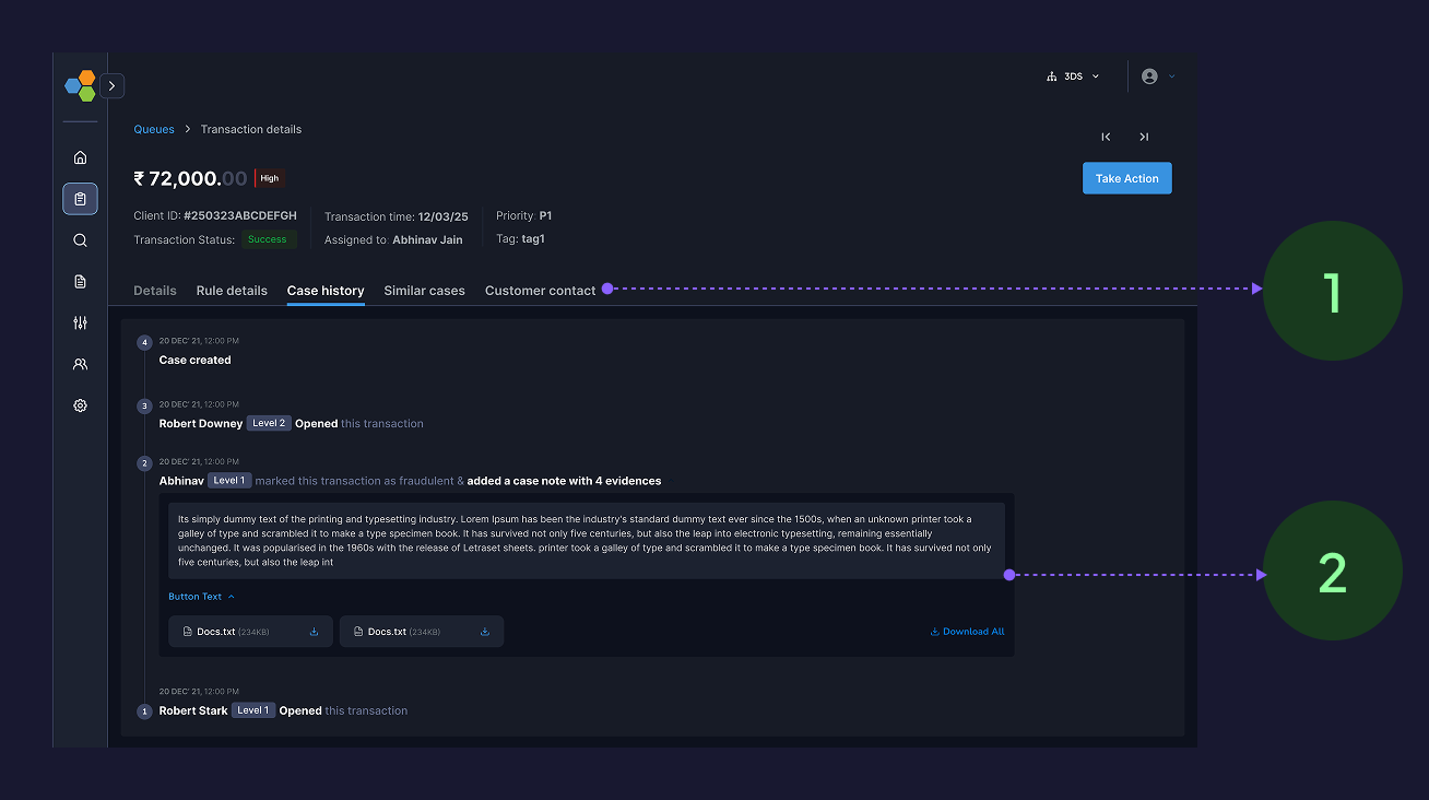
- Timeline view of events captured helps analyst to understand what past actions have been taken
- Analysts can also see the evidences attached for the case in past helps to investigate the case with precision
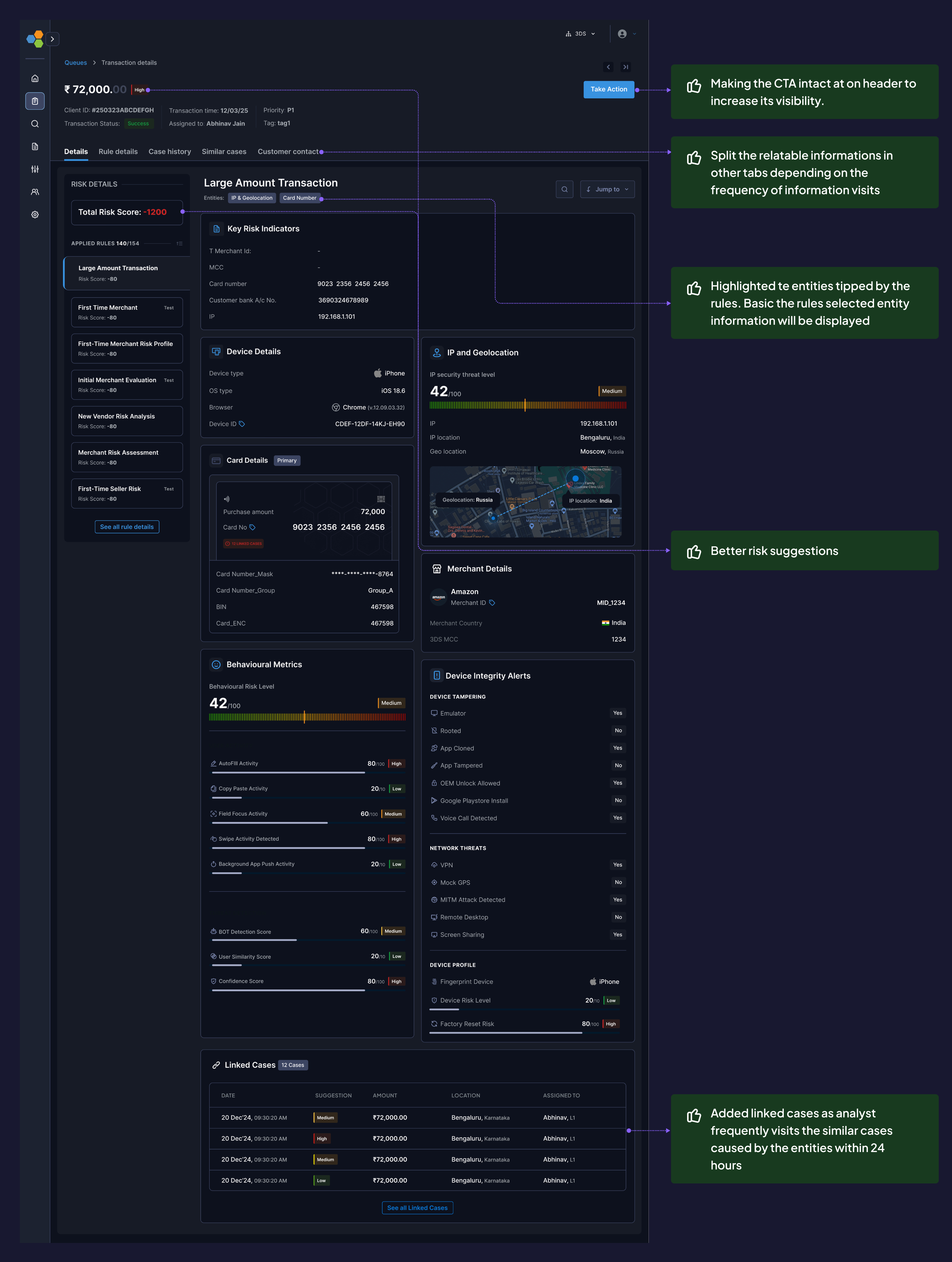
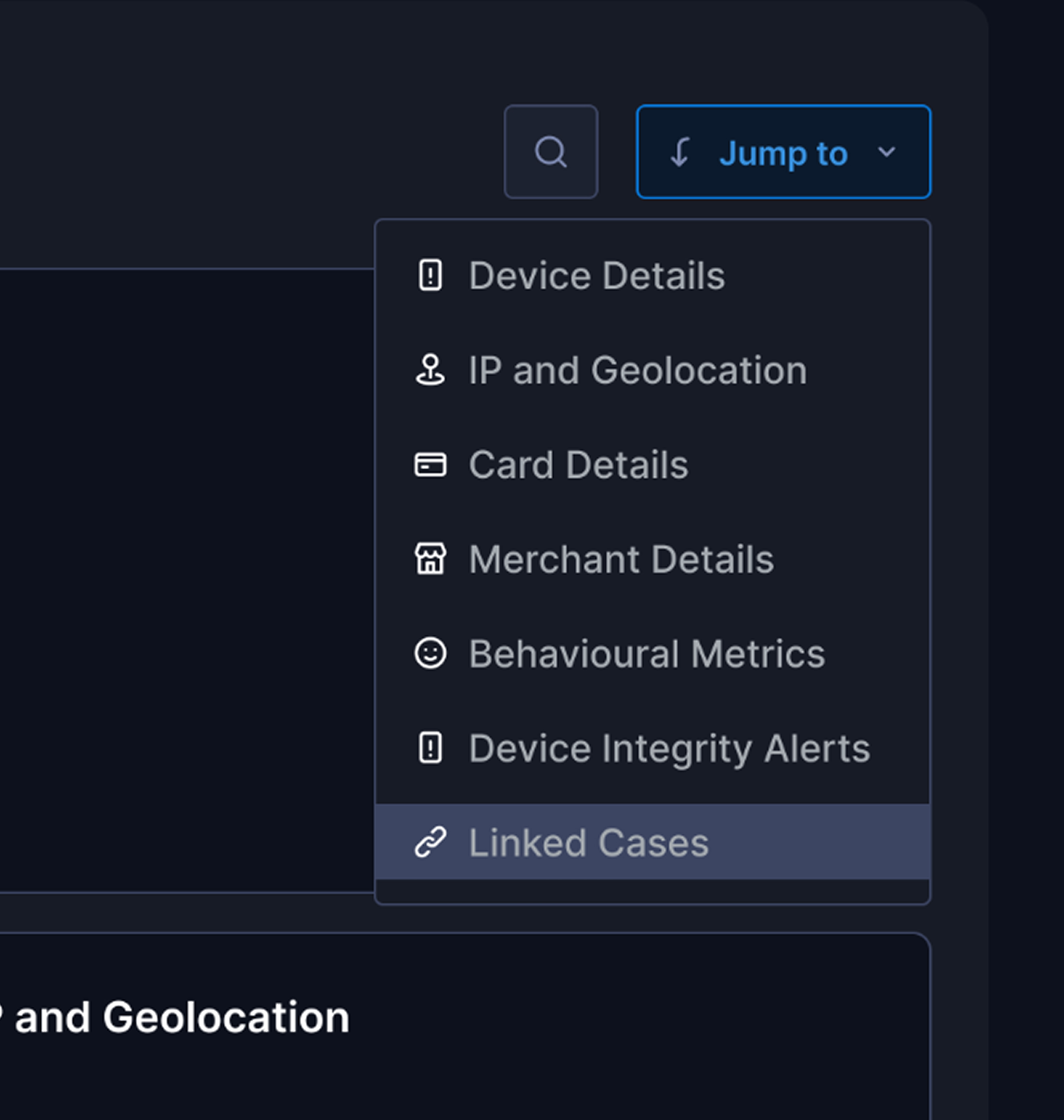
Decision 8: Information Architecture Changes
Before
- Single-page scroll with 18 sections
After: Tabbed structure
Tab 1 (Investigation): Primary workspace with bento layout (80% of time spent here)
Tab 2 (Related Alerts): Linked cases and entity history
Tab 3 (Audit Log): Full event timeline and compliance data
Why this matters
- Reduced primary screen from 14 scrolls → 3 scrolls
- Separated high-frequency data (investigation) from low-frequency data (audit logs)
- Analytics showed 91% of sessions only needed Tab 1
- Making the CTA intact at on header to increase its visibility.
- Split the relatable informations in other tabs depending on the frequency of information visits
- Highlighted te entities tipped by the rules. Basic the rules selected entity information will be displayed
- Added linked cases as analyst frequently visits the similar cases caused by the entities within 24 hours
What else
Small enhancements
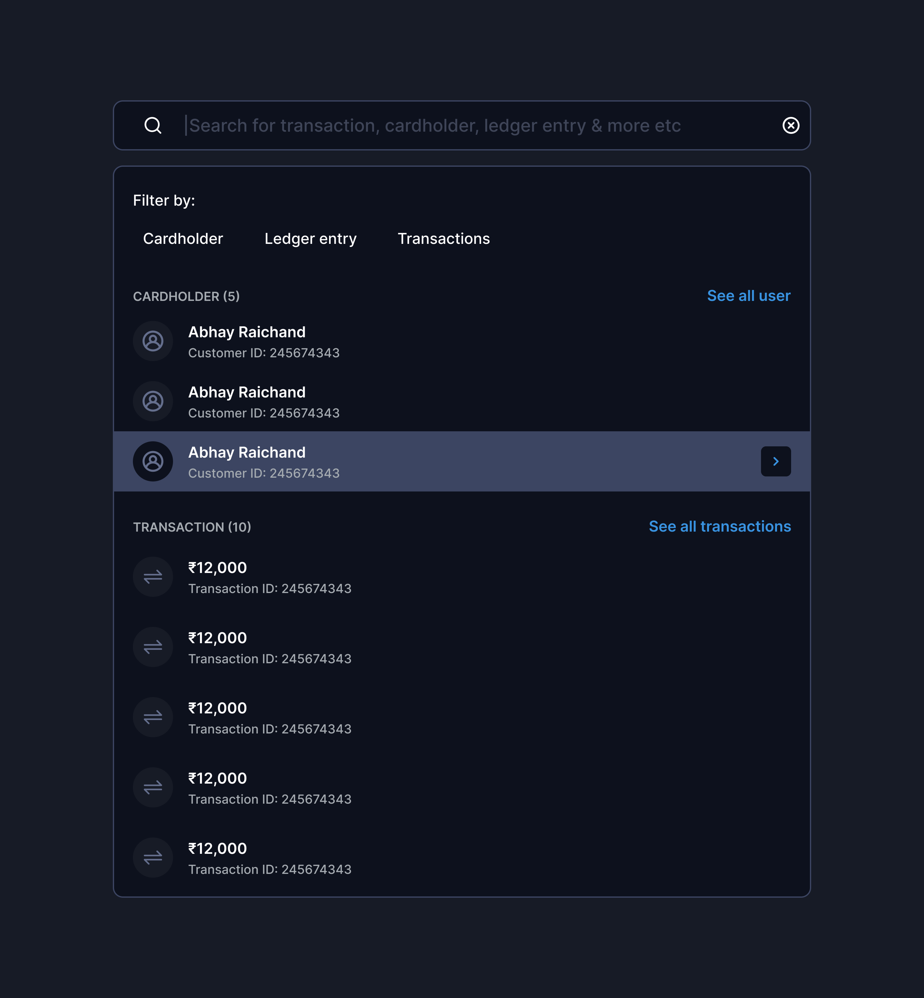
Quick link/jumps
Keyboard shortcuts
Intelligent search
Rationale: 80% of users are power users handling 80+ cases/day. Shaving 10 seconds per case = 13 min saved per analyst per day = 65 hours saved monthly across 50 analysts.
Validations - Achieved from Heatmap analysis & Clevertap events
Impacts & Outcomes
Business Impact: Prevented churn of 2 tier-1 banks ($4.2M ARR) · $2.16M annual cost savings · Analyst NPS: 32 → 68
User & Stakeholders feedback
”This is the first time our analysts actually volunteered to use the new version before training.
VP Risk Operations, Axis Bank
We're closing 30% more cases per shift without increasing headcount.
Risk team, BDO
Cleanest design handoff we've received – detailed Figma specs with interaction states, edge cases, and API payload
Engineering Lead, Wibmo
Additional Impact: PM used this case study in sales demos → contributed to 3 new enterprise deals in Q4
What changed
How this influenced Trident's roadmap
- Applied bento layout + signal-first IA to Transaction Monitoring (launched Q3 2025)
- Keyboard shortcuts + quick actions now standard across platform
- "Behavioral anomaly" pattern extended to Merchant Risk Scoring
Additional Impact: PM used this case study in sales demos → contributed to 3 new enterprise deals in Q4
In the end
What did I learned as a designer
Constraints Drive Better Solutions
The bento layout emerged from backend constraints driving creative problem-solving.
Design for 80%, Configure for 20%
I focused on strong defaults with configurable options instead of covering every edge case.
Validate Metrics Before Committing
I set verdict accuracy as success metric, but lacked reliable post-launch measurement.
Design Systems Are Multipliers
Bridging old to new design systems was painful, but reusable components saved ~200 design hours.
What didn’t worked?
Search Adoption
- Only 23% adoption
- Root cause: analysts preferred scanning over typing
- Action: Deprioritized search, doubled down on visual hierarchy
Linked Cases Performance
- Latency spikes with >50 entities
- Shipped lazy loading + pagination
What next
hey hey hey! Wait✋🏻 there is much more coming 🏃🏻
You can’t solve all the problems together, as the next steps we are integrating AI based initiatives to make our platform more modular & efficient
AI Summary & verdicts
AI based documents & case notes
More work from Vishesh
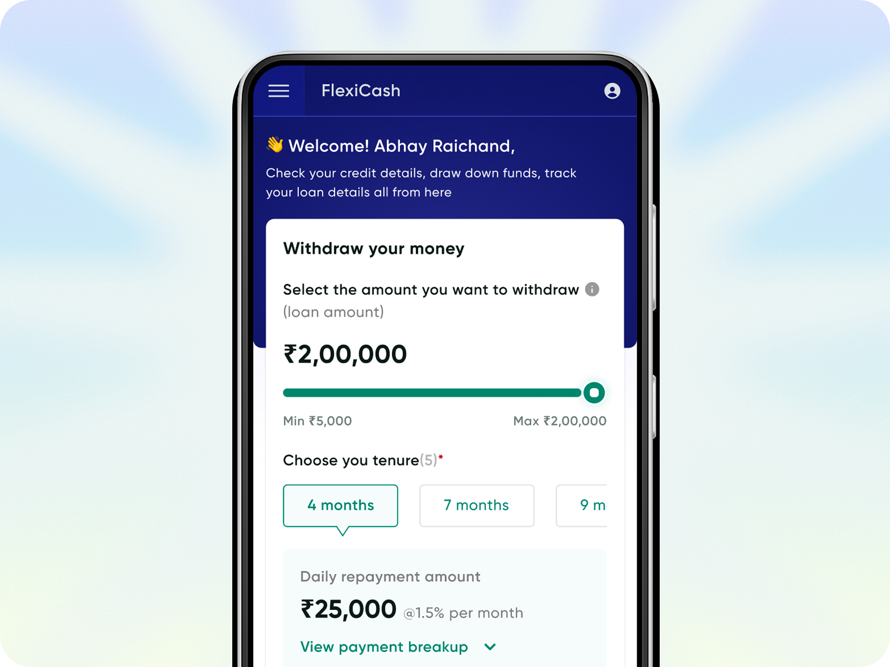
FlexiCash: for all your short term credit needs
Live Now
Enhance the pre & Post onboarding journey with better solutions available for less time-consuming & reduction in miscommunication
33%

Credit disbursal ratio
43%
Sanction applications
76%

Total click rates
63%
DIY adoption rate
From Cognitive Overload
to AI Powered Clarity
Coming soon
Agentic AI that handles the cognitive lifting while amplifying human judgment, and final decision-making authority.
End to end User research
Visual design
Communication
Usability testing
Product thinking
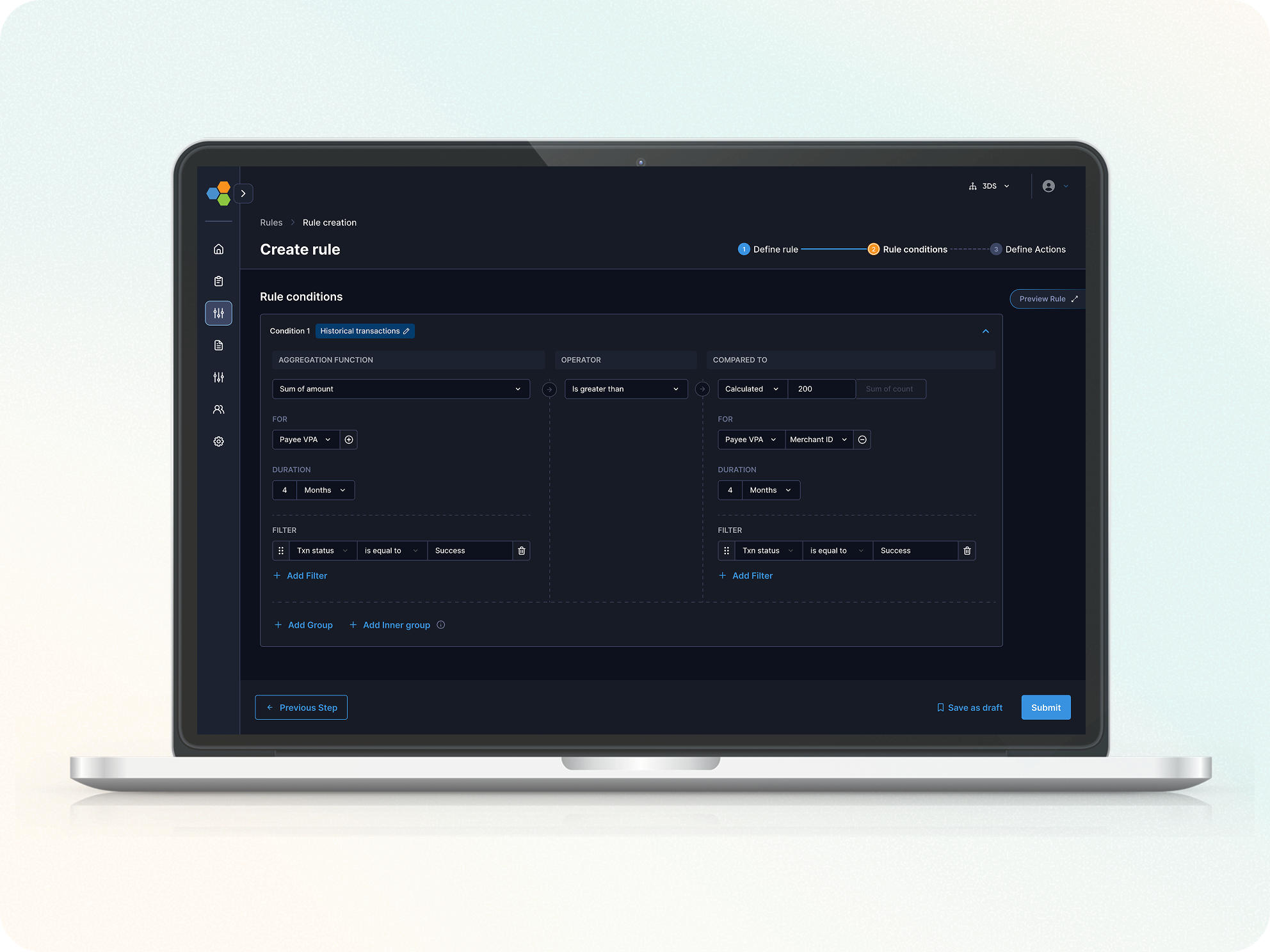
Streamlined Rule Creation for risk analysts
Live Now
How we reduced Rule creation Setup time by 62% to enhance the increment in DIY journey for our fraud & risk management platform
53%

Rule creation completion rate
38%
DIY adoption rate
48%

Error Rate per Step
62%
Rule creation completion time
"Between endless tabs and infinite scroll, you paused here.
Thanks for choosing my pixels!"🙏