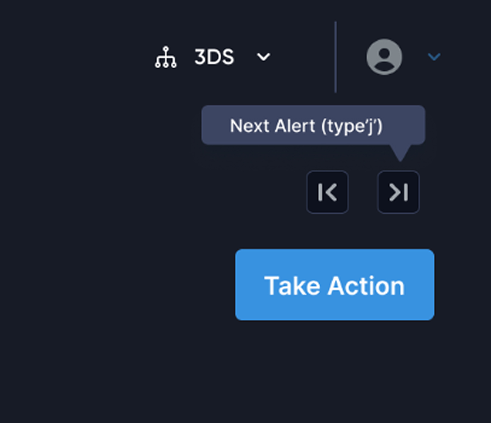


Quick link/jumps
For the analyst to move among sections quickly I provided a jump to option.
TRIDENT | FRAUD & RISK PLATFORM | CASE INVESTIGATION | 2025
From Noise to Signal: Streamlining a fragmented transaction fraud investigation workspace that speeds up decision to give verdict by 76%.
Note: This case study involves the redesign with new design system & brand guidelines so you might see a drastic difference in branding from the current design
Overview
Trident powered by Wibmo is a fraud and risk management solution for banks that detects suspicious activity on transactions, priorities alerts, & streamlines investigations
How does it work?
Trident, as a real- time evaluation engine allows to setup risk rules & models. All these rules & models triggers on each transactions & in return Trident produces “Risk suggestions” as output

Why is this transaction risky?
Let me have a look 👀

Wibmo’s “TRIDENT” is one of flagship Fraud & risk management solution has set gold standard for next-generation delivering 40% improvement in precision.
It simply shows that something isn’t going well with our case investigation module & needs an urgent fix. So how do we find out?
All hands
Meet the Artists
Product Design Lead — UX Research, Visual Design Prototyping, User Flows, Product Strategy.
PM: Ayush Aggarwal, George Mathew, Saurabh Kumar
Design: Vishesh Raj
Eng: Shashi Gupta
JUL’ 25 - AUG’25
(3 weeks)
Impacts
Decrement in time to verdict
Increment in cases closed without rework within 24–48 hours.
Increment in accuracy of risk suggestion wrt verdict
Decrement in missing deadlines for priority case closures
ie. how does the analyst investigate a case currently,
The analysts struggles to find the relevant information due to poor category & priority of data
The analysts struggles to find the relevant information due to poor category & priority of data
Absence of behavioural data like what different patterns create an anomaly while decision making
User interviews
While this exercise was jam-packed with a lot of work, exploration, framing out right set of questionnaires, discussion with stakeholders. It feels impossible to boil down all the things, but if I had to, it would be the key insights that we received
Noise overwhelms signal
Long lists of scattered information bury the few signals that matter most.
No “What Changed” vs Baseline
The page shows current facts but not how they differ from the user’s normal behaviour or peer cohort.
Broken Search
I am unable to search for any specific information it takes too much to understand what falls where
Scattered evidence across pages
Key details live in different places, forcing constant context‑switching and slowing decisions.
Absence of Entity Linkage Visibility
”Relationships across accounts, devices, IPs, and merchants were absent
Context Switching
During a case investigation all the parameters are dumped on page no flagging what parameter caused the alert
No Unified Case Timeline
Events are listed, not sequenced, making it hard to see causality.
No SLA or Priority Signals
Cases lack urgency cues or timers, so analysts miss deadlines.

Persona

“Meet Rajeshwari, a risk analyst at **** bank, At 10:20 A.M opens Case #204592: a high‑value, cross-border wire transfer flagged by 8 rules due to a card txn. happened from a different IP. She has 120 open cases, a backlog rising by 18%, and just 10 minutes per case.
Design appoarch
We analysed 60-70 cases to understand different use-cases and kind of information an analyst looks for while investigating cases
Opted the SLICE approach - i.e piece by piece solving the problem

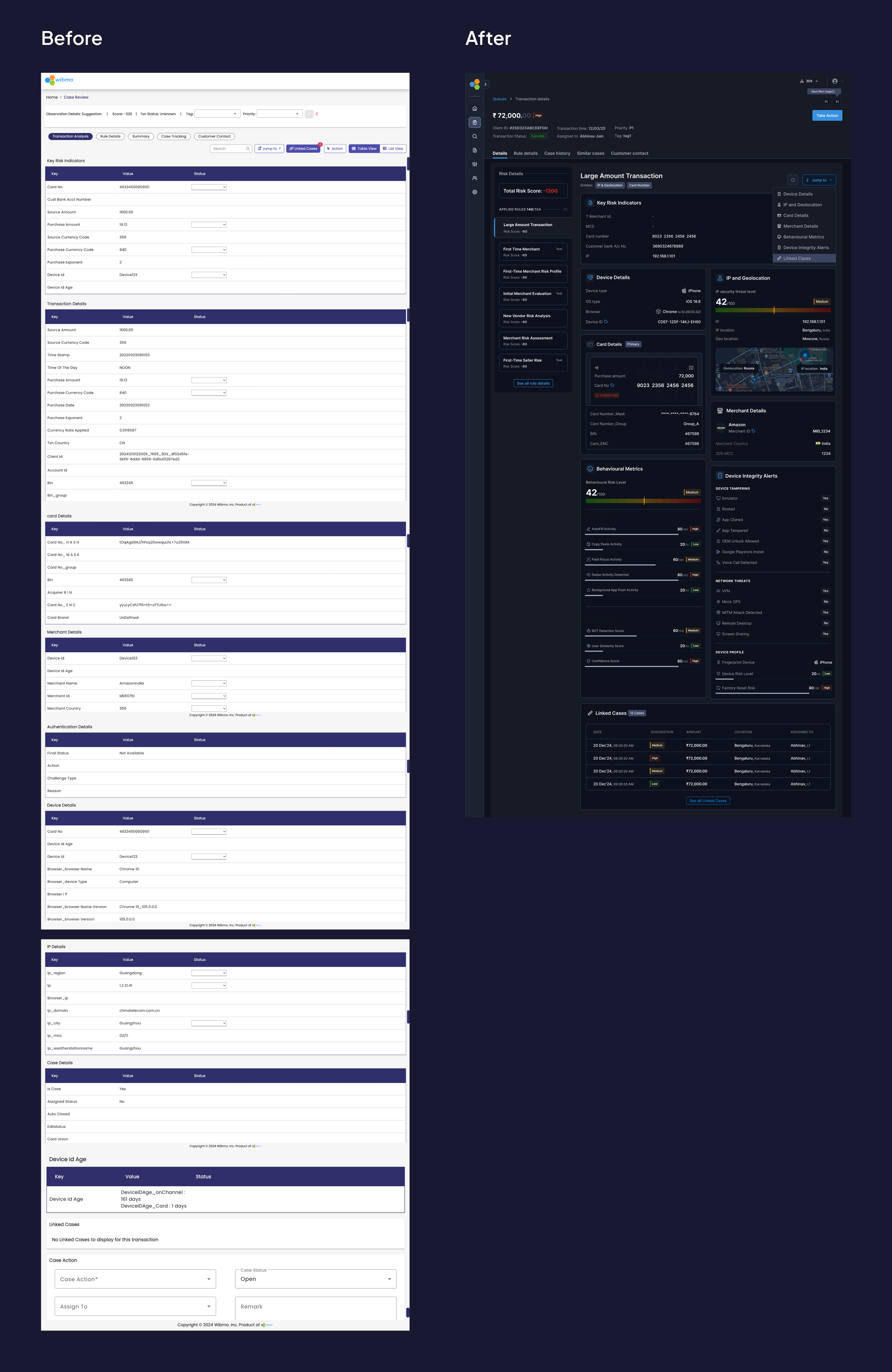
Solution
Since the investigation pages requires a lot amount of data to be displayed, with proper exercises like card sorting we came to see that it will require a number of cards with different entity information, hence I finalised
THE BENTO LAYOUT

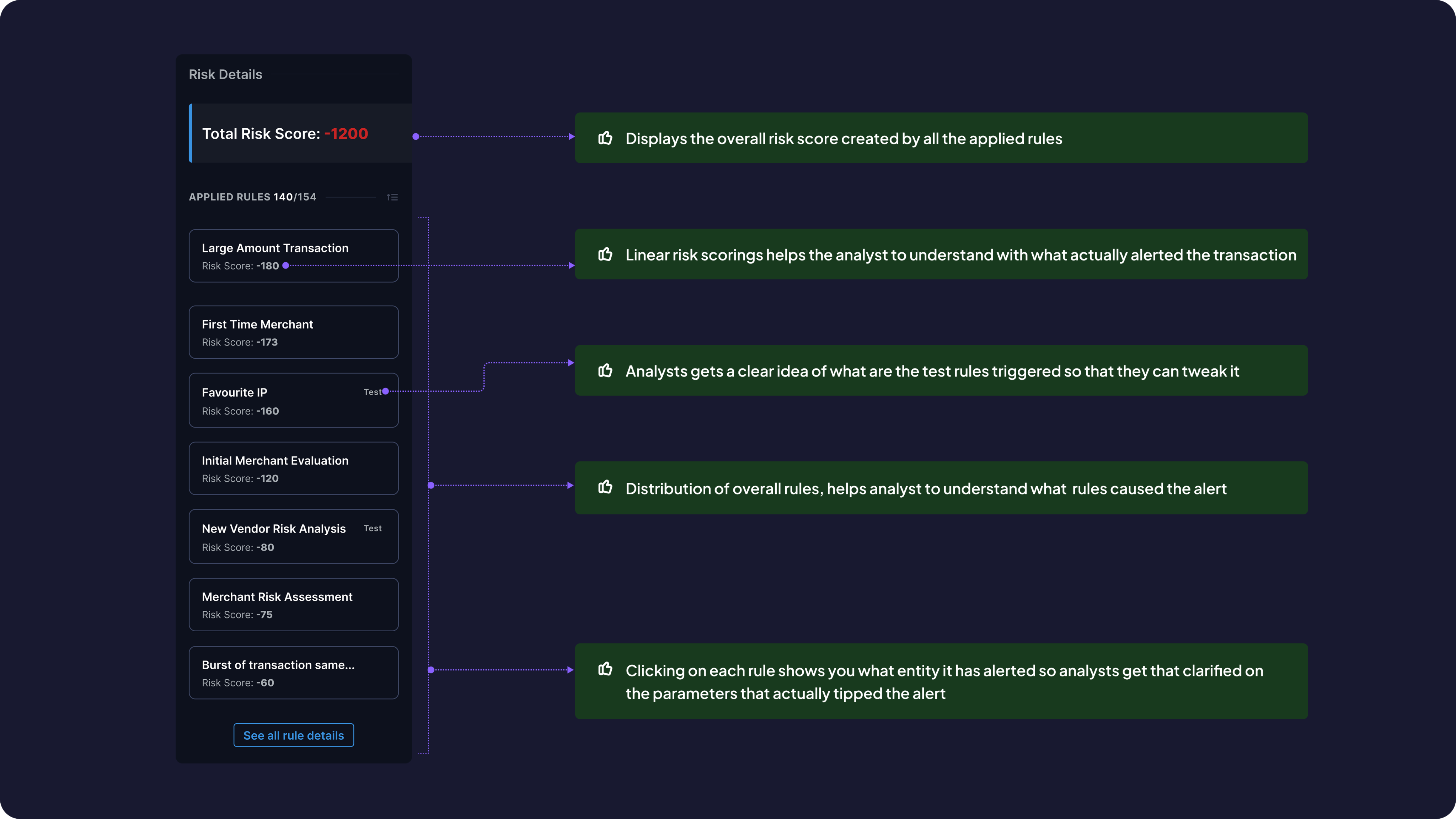
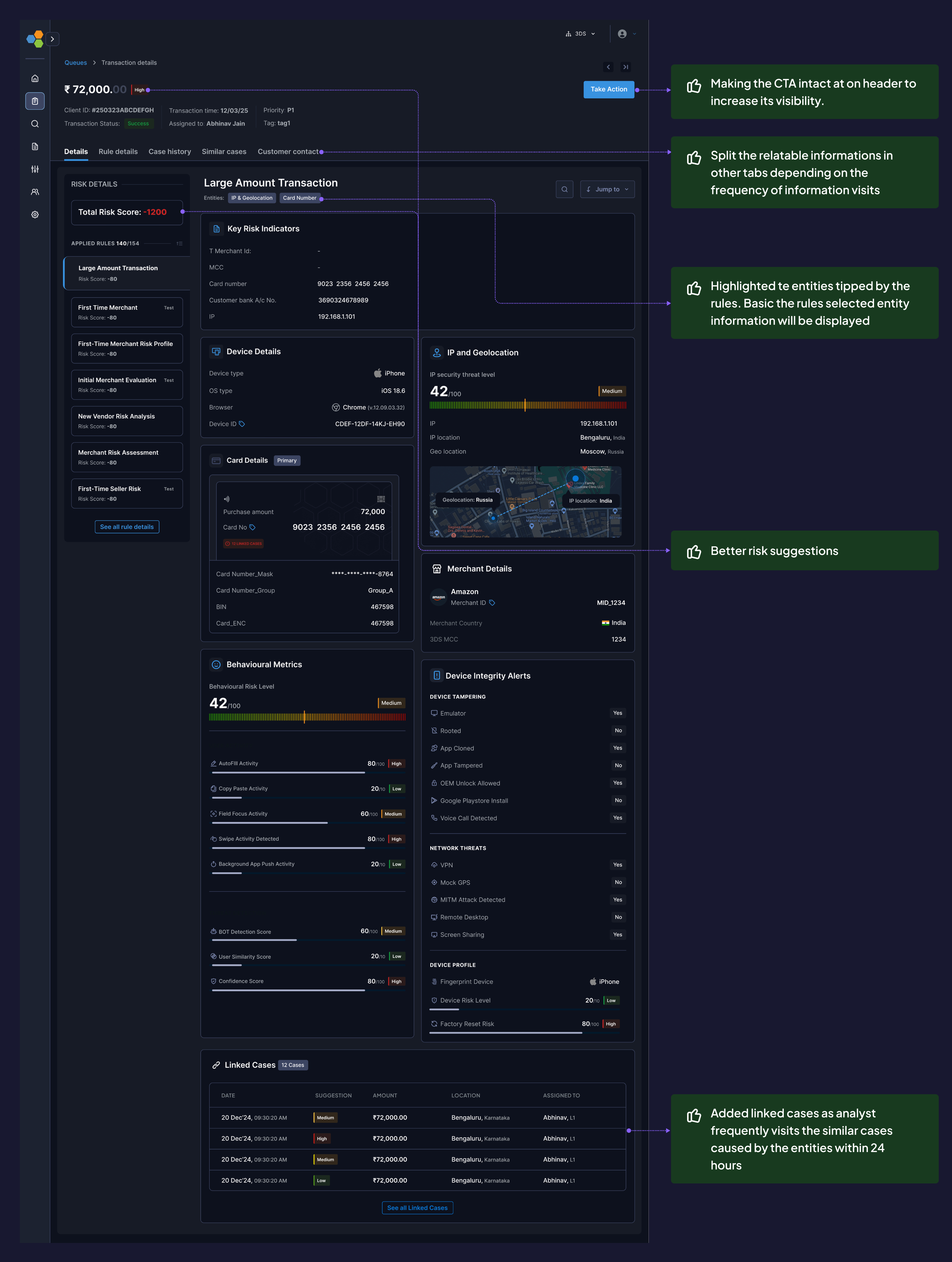
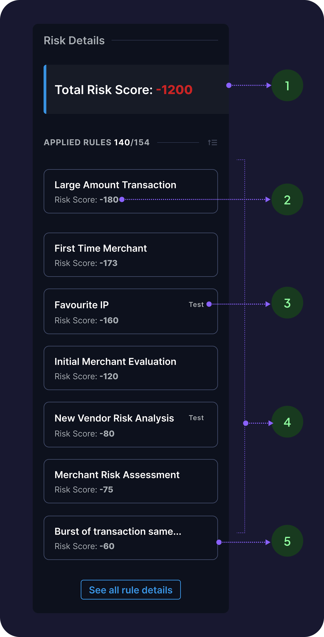
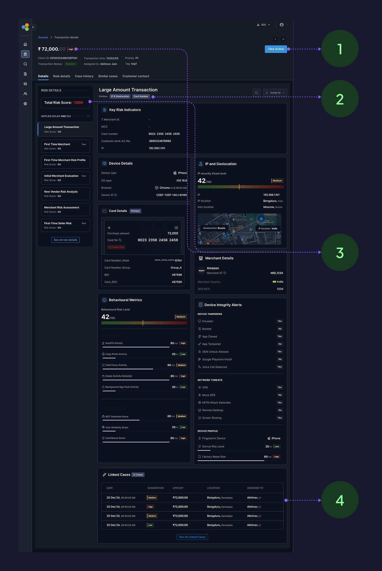
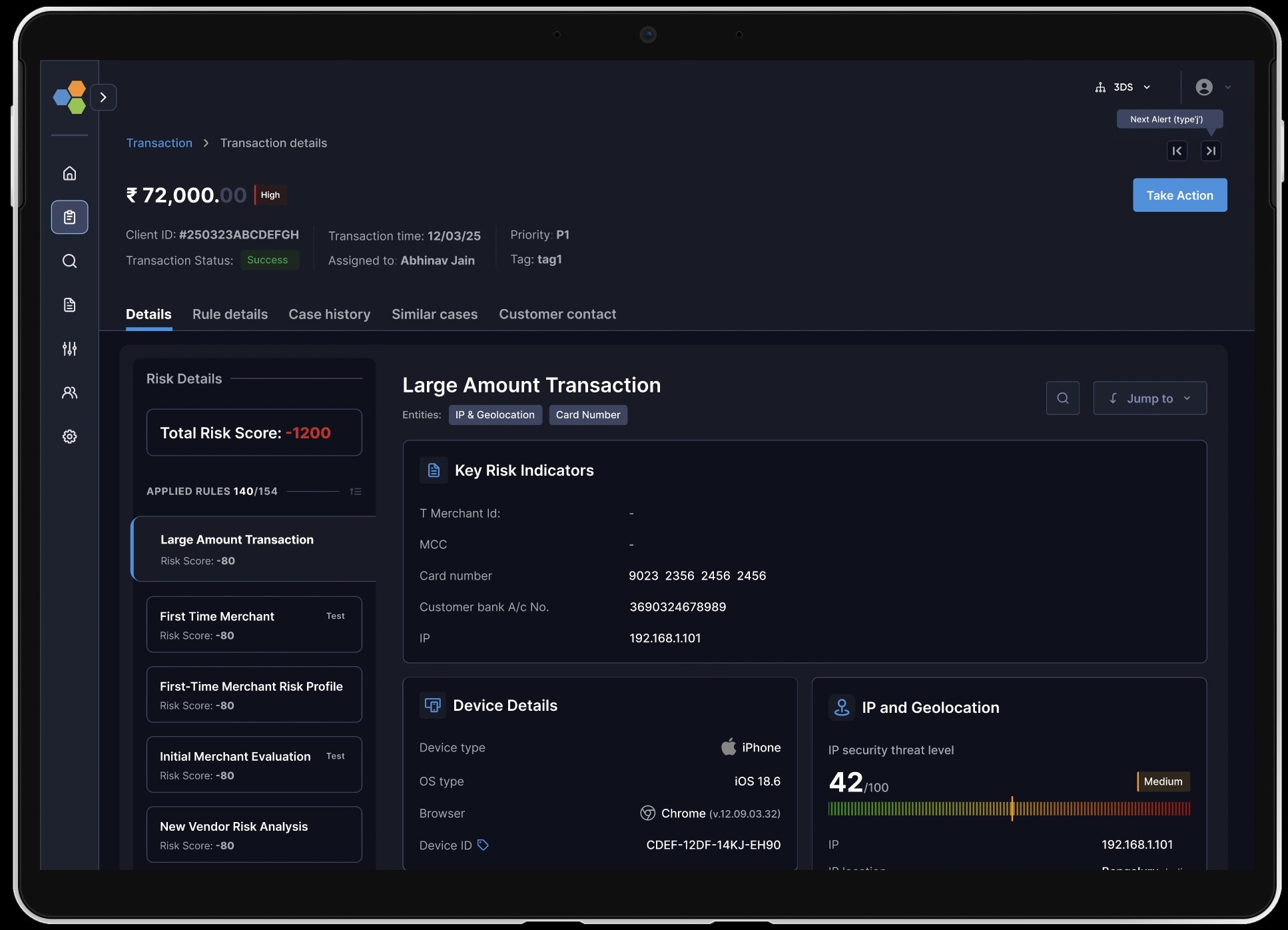
The risk analysts were unable to understand rules behaviour on a transaction, I created a section listing all the rules occuring on a transaction their risk score distribution in descending, this actually helped risk analysts what actually tipped the scale
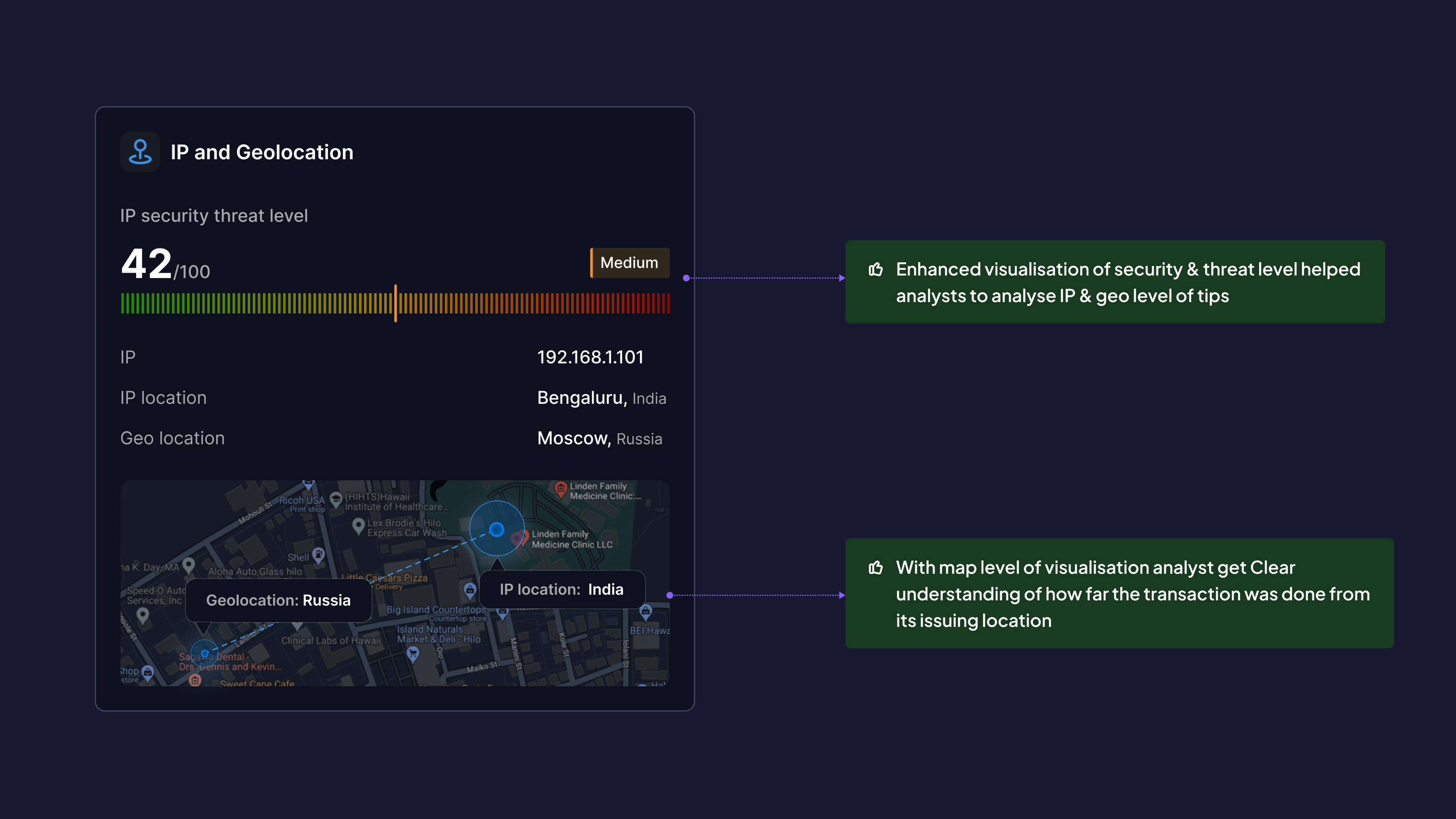
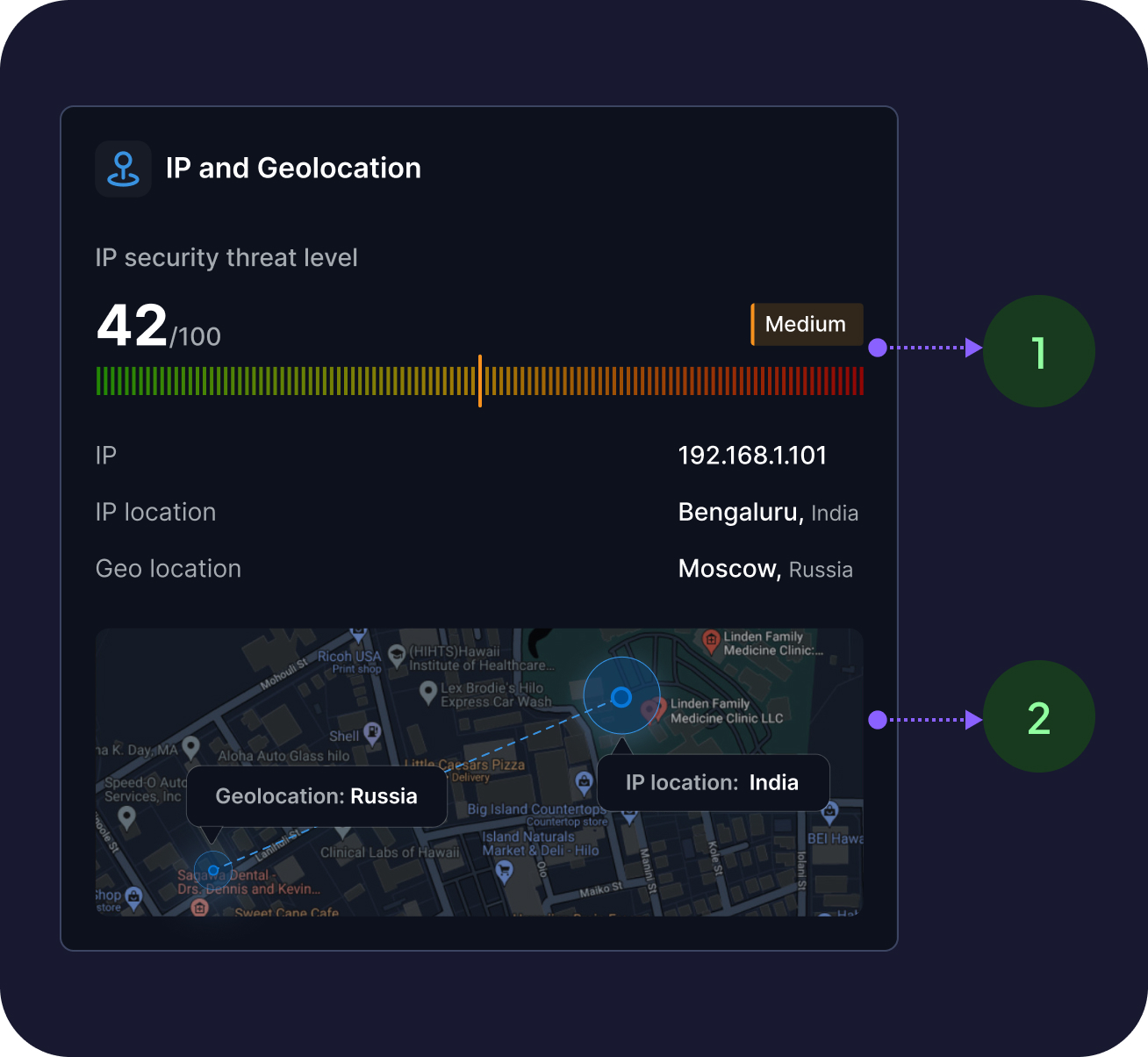
Analysts were not clear with IP & geolocation info. with clear observations from research I found they need better understandings about the threat level
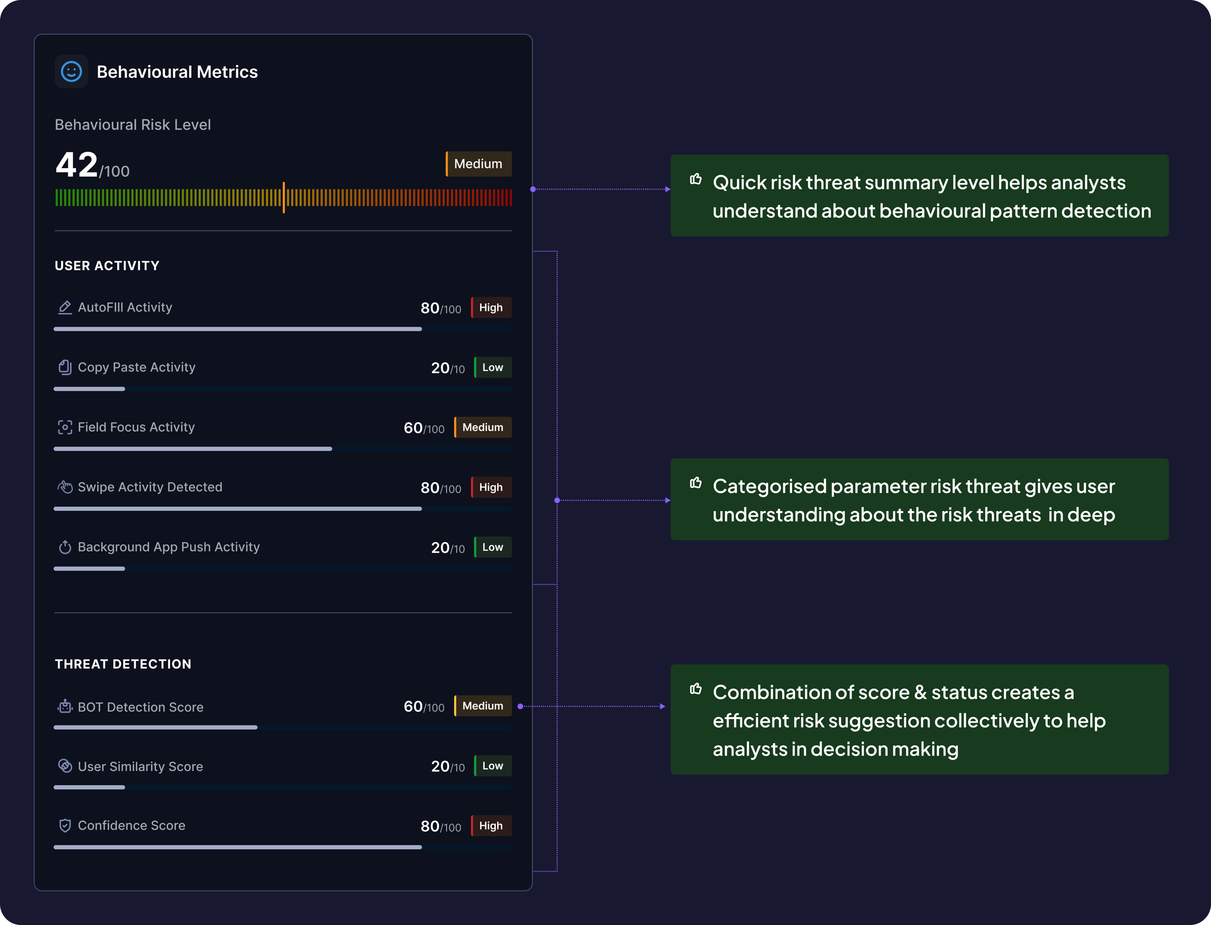
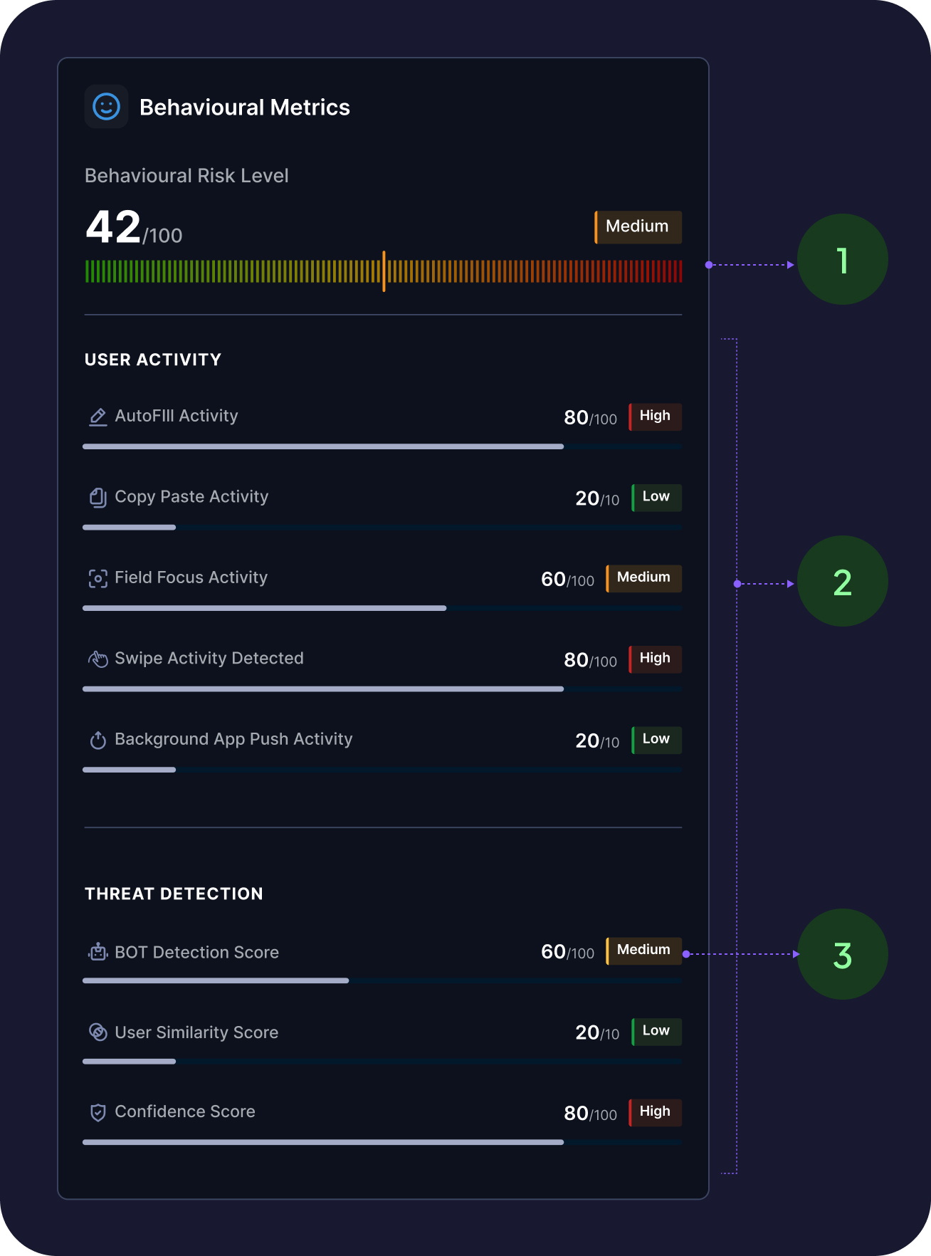
From our initial research we observed that analysts look how the behavioural metrics for the transaction for example whether the OTP was autofill, is there any bot activity detected these information helps analysts to understand the case better
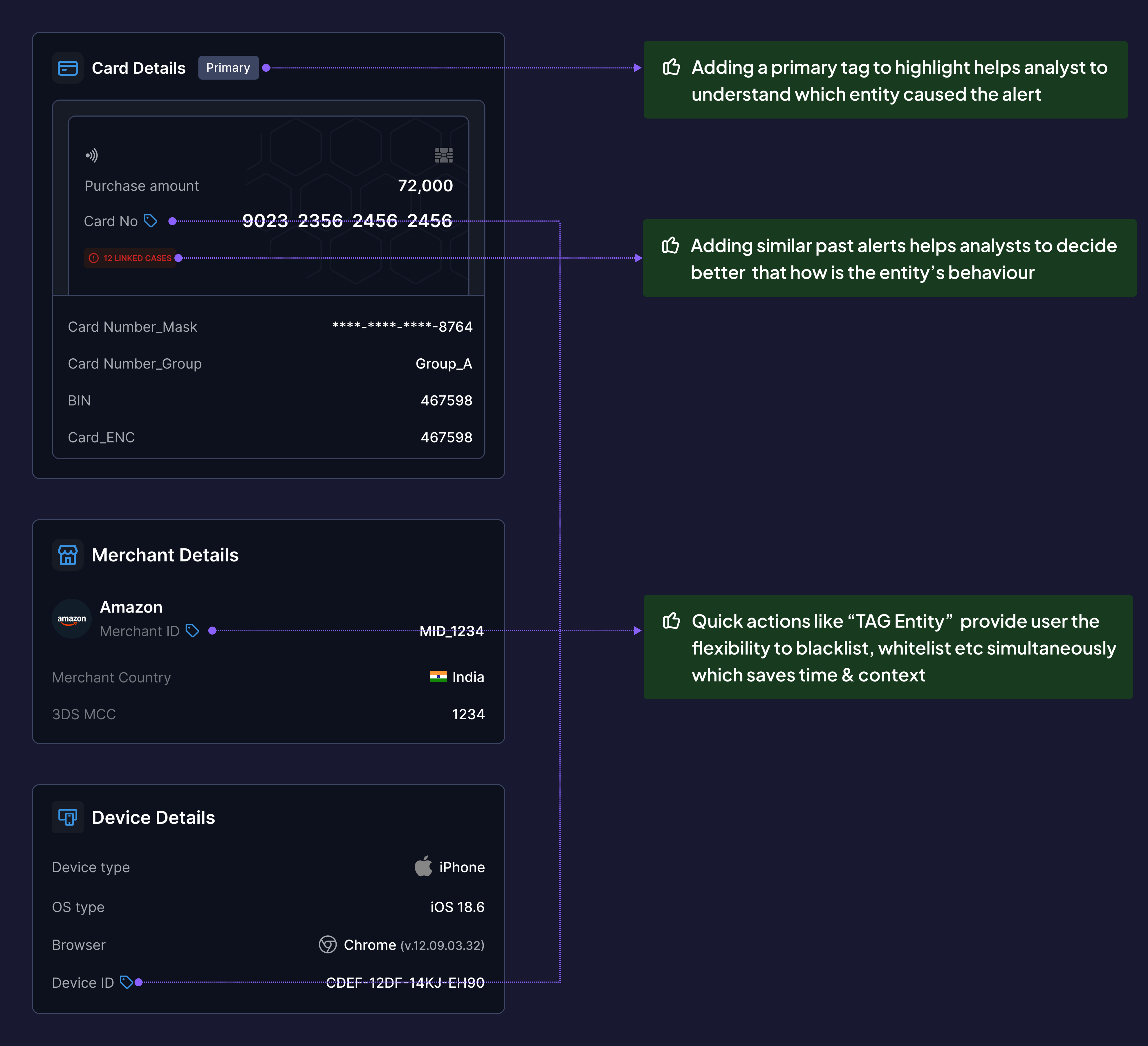
Analysts need relative call to actions and weren’t able to understand which of overall entities caused the alert on primary basis
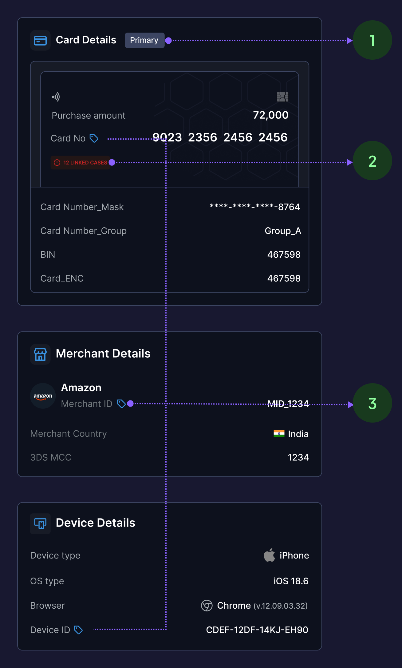
Additional to all individual problems there were a few challenges to solve on overall investigation page to solve this, I created IA and stitched the page together with all info.
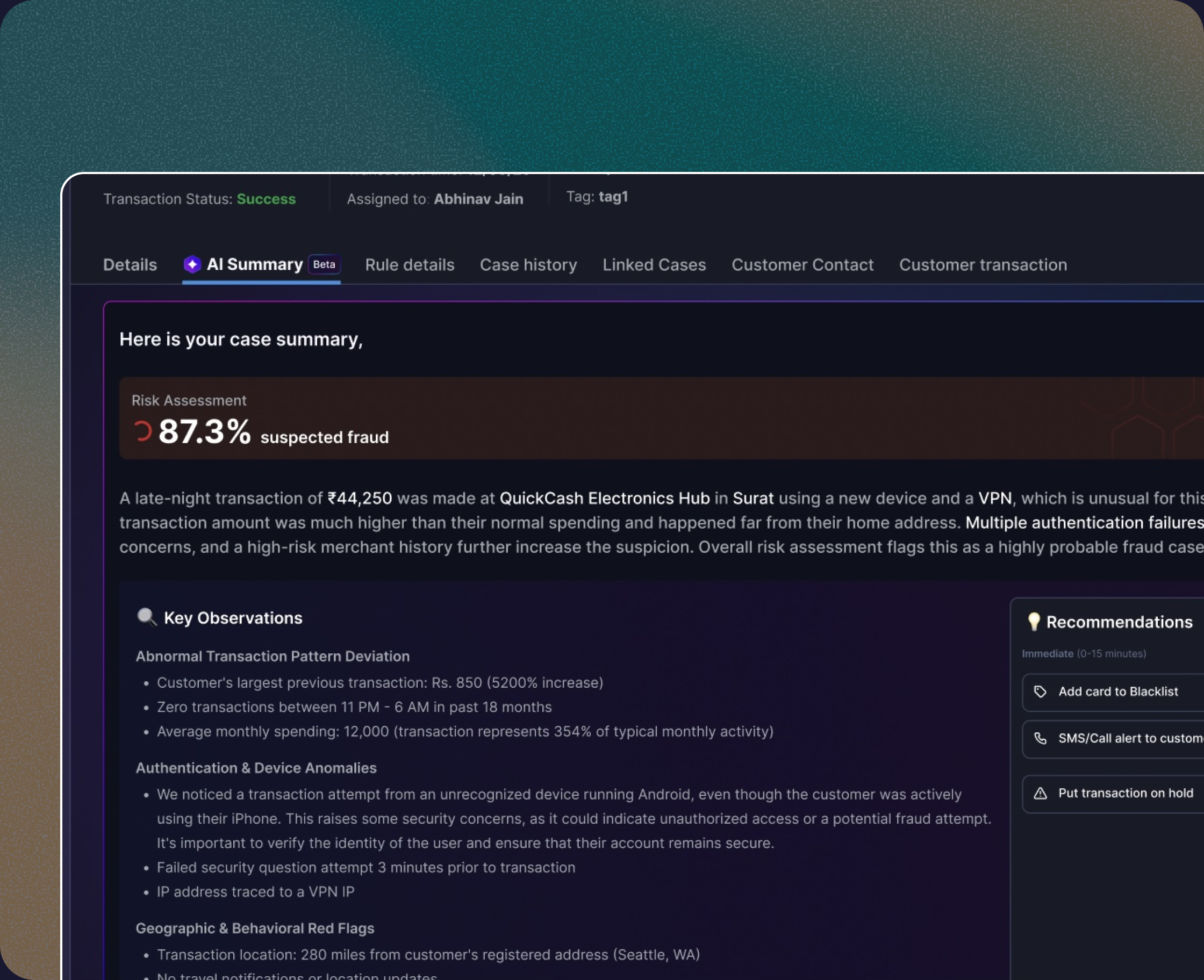
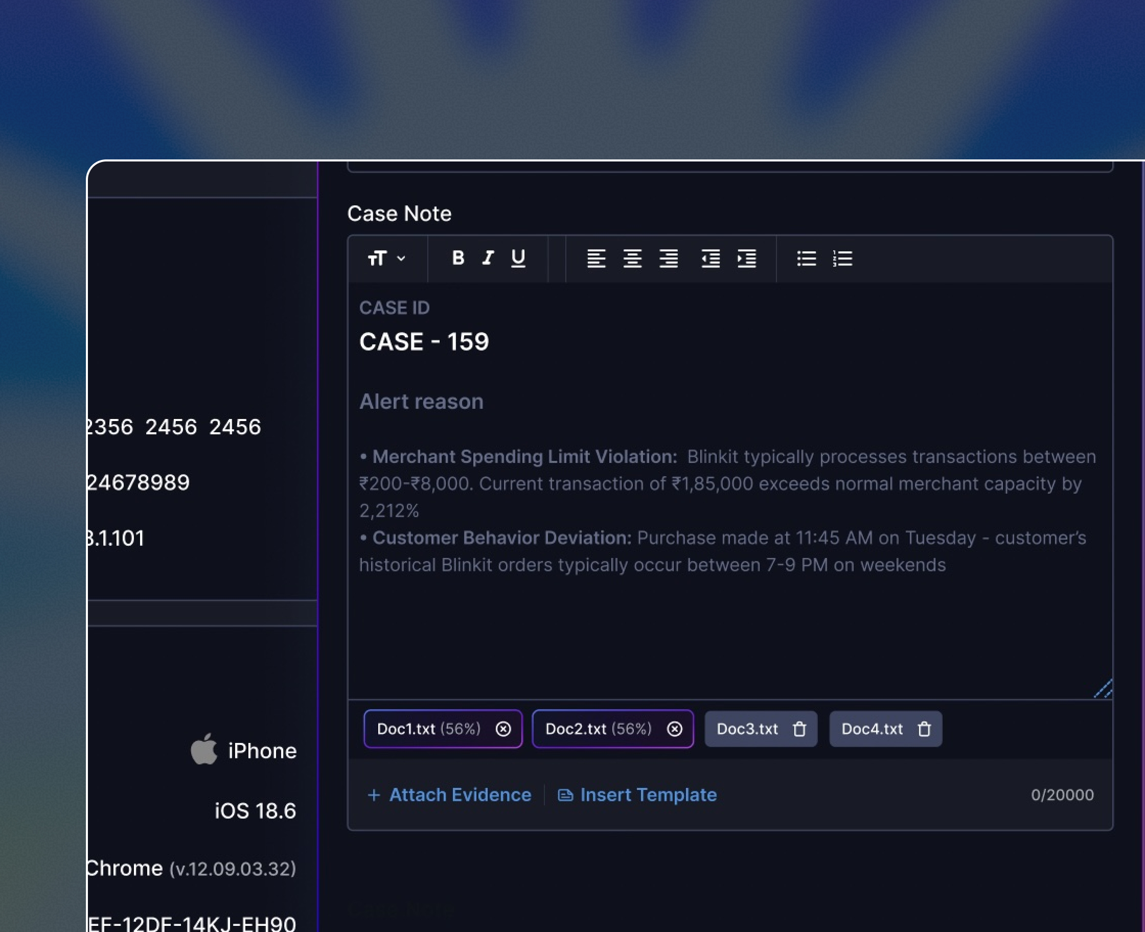
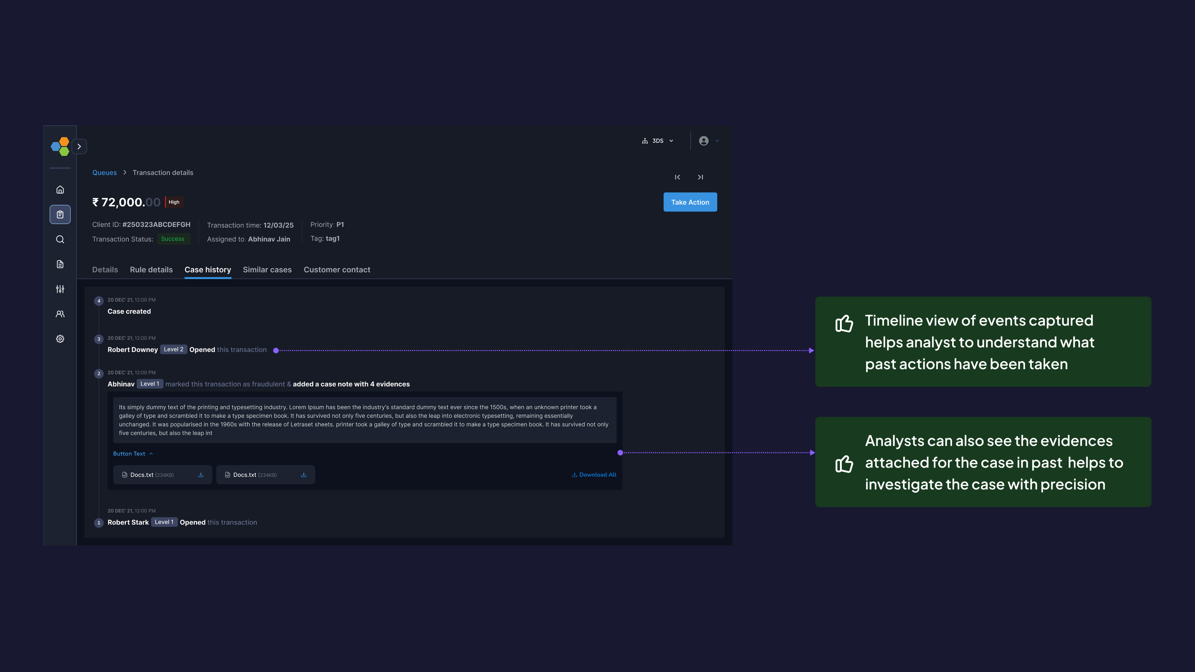
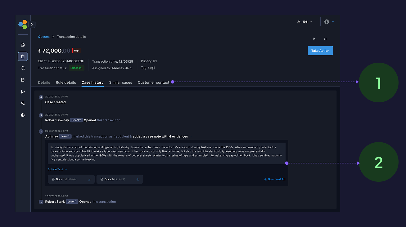
Analysts were struggling to understand the events captured while a case was generated for investigation, hence I created a timeline view of all the events triggered
What else
Isn’t product design also about extras? Let me show you a glimpse of it
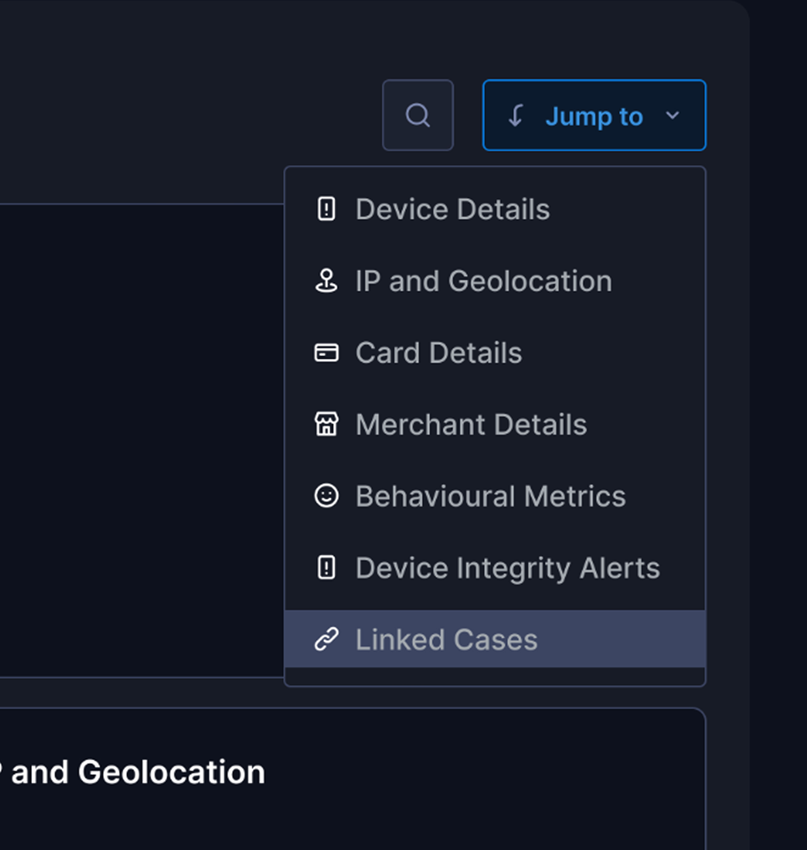
For the analyst to move among sections quickly I provided a jump to option.
To expedite analysts movements we added adaptive & industry standard keyboard shortcuts
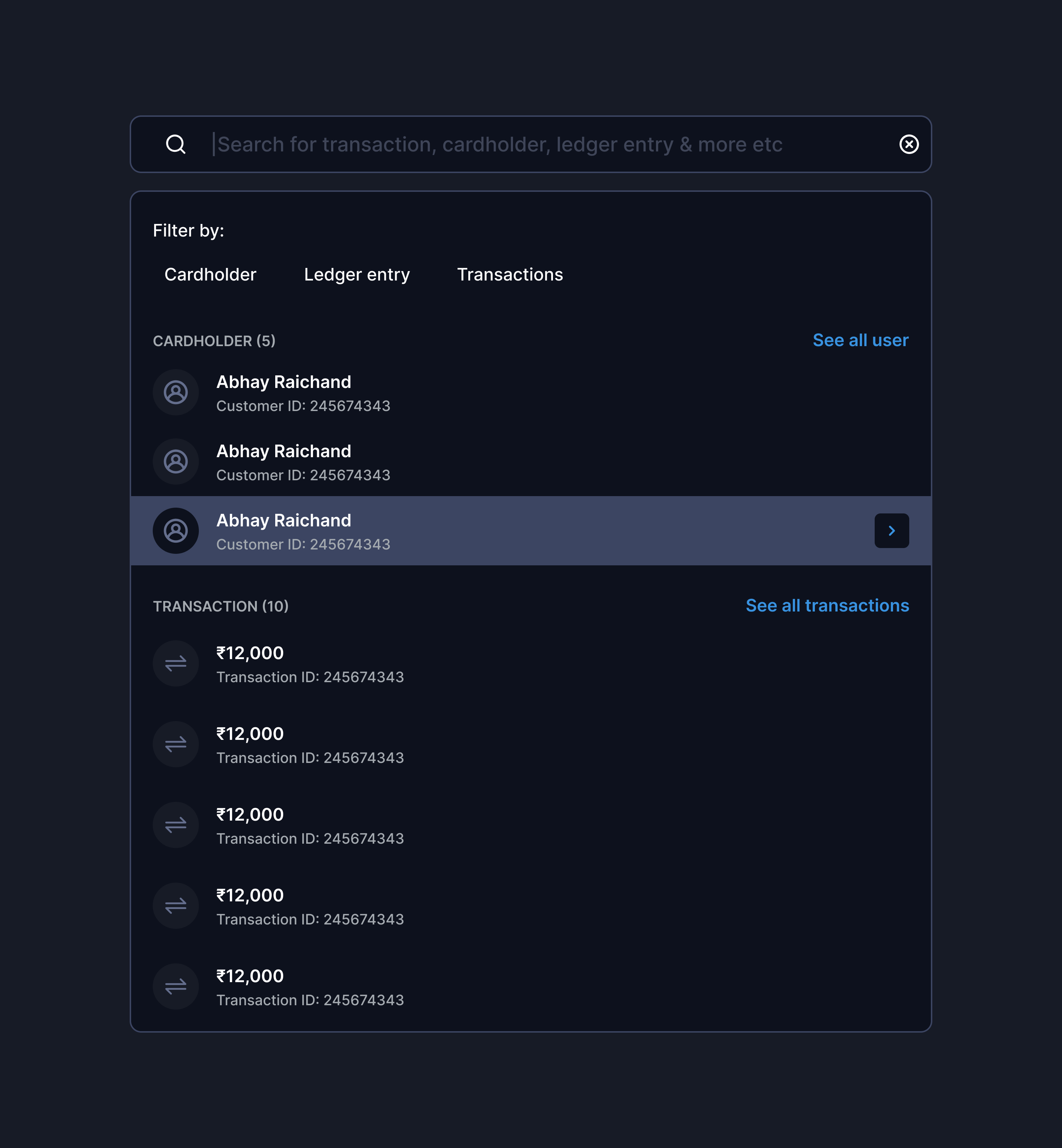
To reduce analysts efforts I built smart & intelligent search basis specific filters and categories
Additional to all individual problems there were a few challenges to solve on overall investigation page to solve this, I created IA and stitched the page together with all info.
What next
You can’t solve all the problems together, as the next steps we are integrating AI based initiatives to make our platform more modular & efficient
In the end
Improving the experience with limited tech stack efficiency
This project was full of battles with Tech, as the backend stack was old & codes were massaged hence team were not aligned on a lot of feature building.
Discovering insights throughout the project
Throughout the project we were discovering new insights as each cases required a different mental models involved.
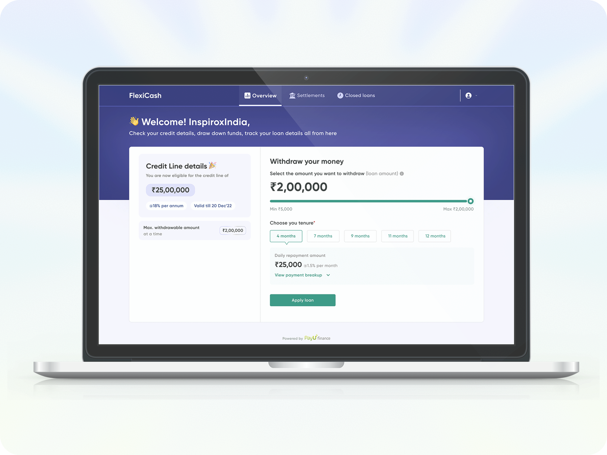
FlexiCash: for all your short term credit needs
Live Now
Enhance the pre & Post onboarding journey with better solutions available for less time-consuming & reduction in miscommunication
33%

Credit disbursal ratio
43%
Sanction applications
76%

Total click rates
63%
DIY adoption rate
From Cognitive Overload
to AI Powered Clarity
Coming soon
Agentic AI that handles the cognitive lifting while amplifying human judgment, and final decision-making authority.
End to end User research
Visual design
Communication
Usability testing
Product thinking
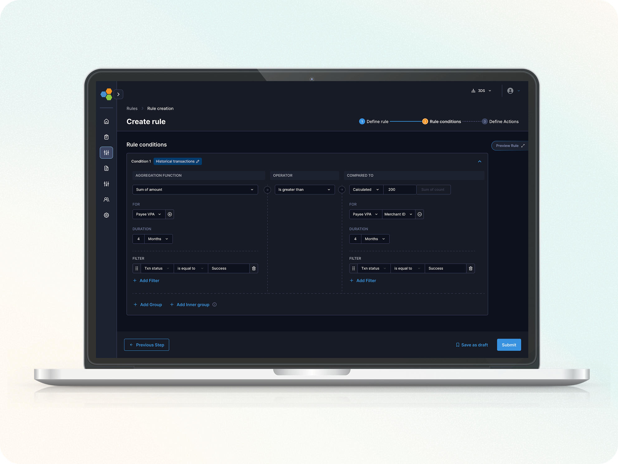
Streamlined Rule Creation for risk analysts
Live Now
How we reduced Rule creation Setup time by 62% to enhance the increment in DIY journey for our fraud & risk management platform
53%

Rule creation completion rate
38%
DIY adoption rate
48%

Error Rate per Step
62%
Rule creation completion time
"Between endless tabs and infinite scroll, you paused here. Thanks for choosing my pixels!"🙏
TRIDENT | FRAUD & RISK PLATFORM | CASE INVESTIGATION | 2025
From Noise to Signal: Streamlining a fragmented transaction fraud investigation workspace that speeds up decision to give verdict by 76%.
Note: This case study involves the redesign with new design system & brand guidelines so you might see a drastic difference in branding from the current design
Overview
Trident powered by Wibmo is a fraud and risk management solution for banks that detects suspicious activity on transactions, priorities alerts, & streamlines investigations
How does it work?
Trident, as a real- time evaluation engine allows to setup risk rules & models. All these rules & models triggers on each transactions & in return Trident produces “Risk suggestions” as output
Why is this transaction risky?
I need to investigate it in detail 👀

Wibmo’s “TRIDENT” is one of flagship FRM solution has set gold standard for next-generation delivering 40% improvement in precision.
It simply shows that something isn’t going well with our case investigation module & needs an urgent fix. So how do we find out?
All hands
Meet the Artists
Product Design Lead — UX Research, Visual Design Prototyping, User Flows, Product Strategy.
PM: Ayush Aggarwal, George Mathew, Saurabh Kumar
Design: Vishesh Raj
Eng: Shashi Gupta
JUL’ 25 - AUG’25
(3 weeks)
Impacts
Decrement in time to verdict
Increment in cases closed without rework within 24–48 hours.
Increment in accuracy of risk suggestion wrt verdict
Decrement in missing deadlines for priority case closures
ie. how does the analyst investigate a case currently,
The analysts struggles to find the relevant information due to poor categorisation & prioritised data
The analysts struggles to find the relevant information due to poor categorisation & prioritised data
Absence of behavioural data like what different patterns create an anomaly while decision making
User interviews
While this exercise was jam-packed with a lot of work, exploration, framing out right set of questionnaires, discussion with stakeholders. It feels impossible to boil down all the things, but if I had to, it would be the key insights that we received
Noise overwhelms signal
Long lists of scattered information bury the few signals that matter most
No “What Changed” vs Baseline
The page shows current facts but not how they differ from the user’s normal behaviour or peer cohort.
Broken Search
I am unable to search for any specific information it takes too much to understand what falls where
Scattered evidence across pages
Key details live in different places, forcing constant context‑switching and slowing decisions.
Absence of Entity Linkage Visibility
”Relationships across accounts, devices, IPs, and merchants were absent
Unclear “Why Flagged” Reasoning
During a case investigation all the parameters are dumped on page no flagging what parameter caused the alert
No Unified Case Timeline
Events are listed, not sequenced, making it hard to see causality.
No SLA or Priority Signals
Cases lack urgency cues or timers, so analysts miss deadlines.
Persona

“Meet Rajeshwari, a risk analyst at **** bank, At 10:20 A.M opens Case #204592: a high‑value, cross-border wire transfer flagged by 8 rules due to a card txn. happened from a different IP. She has 120 open cases, a backlog rising by 18%, and just 10 minutes per case.
Design appoarch
We analysed 60-70 cases to understand different use-cases and kind of information an analyst looks for while investigating cases
Opted the SLICE approach - i.e piece by piece solving the problem
Solution
Since the investigation pages requires a lot amount of data to be displayed, with proper exercises like card sorting we came to see that it will require a number of cards with different entity information, hence I finalised
THE BENTO LAYOUT
The risk analysts were unable to understand rules behaviour on a transaction, I created a section listing all the rules occuring on a transaction their risk score distribution in descending, this actually helped risk analysts what actually tipped the scale
Analysts were not clear with IP & geolocation info. with clear observations from research I found they need better understandings about the threat level
From our initial research we observed that analysts look how the behavioural metrics for the transaction for example whether the OTP was autofill, is there any bot activity detected these information helps analysts to understand the case better
Analysts need relative call to actions and weren’t able to understand which of overall entities caused the alert on primary basis
Additional to all individual problems there were a few challenges to solve on overall investigation page to solve this, I created IA and stitched the page together with all info.
Analysts were struggling to understand the events captured while a case was generated for investigation, hence I created a timeline view of all the events triggered
What else
Isn’t product design also about extras? Let me show you a glimpse of it
For the analyst to move among sections quickly, I provided a jump to option.
To expedite analysts movements we added adaptive & industry standard shortcuts
To reduce analysts efforts I built smart & intelligent search basis specific filters and categories
Additional to all individual problems there were a few challenges to solve on overall investigation page to solve this, I created IA and stitched the page together with all info.
What next
You can’t solve all the problems together, as the next steps we are integrating AI based initiatives to make our platform more modular & efficient
In the end
Improving the experience with limited tech stack efficiency
This project was full of battles with Tech, as the backend stack was old & codes were massaged hence team were not aligned on a lot of feature building.
Discovering insights throughout the project
Throughout the project we were discovering new insights as each cases required a different mental models involved.
"Between endless tabs and infinite scroll, you paused here. Thanks for choosing my pixels!"🙏
TRIDENT | FRAUD & RISK PLATFORM | CASE INVESTIGATION | 2025
From Noise to Signal: Streamlining a fragmented transaction fraud investigation workspace that speeds up decision to give verdict by 76%.
Note: This case study involves the redesign with new design system & brand guidelines so you might see a drastic difference in branding from the current design
Overview
Trident powered by Wibmo is a fraud and risk management solution for banks that detects suspicious activity on transactions, priorities alerts, & streamlines investigations
How does it work?
Trident, as a real- time evaluation engine allows to setup risk rules & models. All these rules & models triggers on each transactions & in return Trident produces “Risk suggestions” as output
Why is this transaction risky?
I need to investigate it in detail 👀

Wibmo’s “TRIDENT” is one of flagship Fraud & risk management solution has set gold standard for next-generation delivering 40% improvement in precision.
It simply shows that something isn’t going well with our case investigation module & needs an urgent fix. So how do we find out?
All hands
Meet the Artists
Product Design Lead — UX Research, Visual Design Prototyping, User Flows, Product Strategy.
PM: Ayush Aggarwal, George Mathew, Saurabh Kumar
Design: Vishesh Raj
Eng: Shashi Gupta
JUL’ 25 - AUG’25
(3 weeks)
Impacts
Decrement in time to verdict
Increment in cases closed without rework within 24–48 hours.
Increment in accuracy of risk suggestion wrt verdict
Decrement in missing deadlines for priority case closures
ie. how does the analyst investigate a case currently,
The analysts had to go through all the information till the end to find the case action segment
The analysts struggle to find relevant information due to poor category & prioritisation of data
Absence of behavioural data like what different patterns create an anomaly while decision making
User interviews
While this exercise was jam-packed with a lot of work, exploration, framing out right set of questionnaires, discussion with stakeholders. It feels impossible to boil down all the things, but if I had to, it would be the key insights that we received
Noise overwhelms signal
Long lists of scattered information bury the few signals that matter most.
No “What Changed” vs Baseline
The page shows current facts but not how they differ from the user’s normal behaviour or peer cohort.
Broken Search
I am unable to search for any specific information it takes too much to understand what falls where
Scattered evidence across pages
Key details live in different places, forcing constant context‑switching and slowing decisions.
Absence of Entity Linkage Visibility
”Relationships across accounts, devices, IPs, and merchants were absent
Unclear “Why Flagged” ReasoningContext Switching
During a case investigation all the parameters are dumped on page no flagging what parameter caused the alert
No Unified Case Timeline
Events are listed, not sequenced, making it hard to see causality.
No SLA or Priority Signals
Cases lack urgency cues or timers, so analysts miss deadlines.
Persona

“Meet Rajeshwari, a risk analyst at **** bank, At 10:20 A.M opens Case #204592: a high‑value, cross-border wire transfer flagged by 8 rules due to a card txn. happened from a different IP. She has 120 open cases, a backlog rising by 18%, and just 10 minutes per case.
Design appoarch
We analysed 60-70 cases to understand different use-cases and kind of information an analyst looks for while investigating cases
Opted the SLICE approach - i.e piece by piece solving the problem
Solution
Since the investigation pages requires a lot amount of data to be displayed, with proper exercises like card sorting we came to see that it will require a number of cards with different entity information, hence I finalised
THE BENTO LAYOUT
The risk analysts were unable to understand rules behaviour on a transaction, I created a section listing all the rules occurring on a transaction with their risk score distribution in descending basis which all the entities those are hit by specific rules will be displayed, this actually helped risk analysts what actually tipped the scale
Analysts were not clear with IP & geolocation info. with clear observations from research I found they need better understandings about the threat level
From our initial research we observed that analysts look how the behavioural metrics for the transaction for example whether the OTP was autofill, is there any bot activity detected these information helps analysts to understand the case better
Analysts need relative call to actions and weren’t able to understand which of overall entities caused the alert on primary basis
Additional to all individual problems there were a few challenges to solve on overall investigation page to solve this,
I created IA and stitched the page together with all information
Analysts were struggling to understand the events captured while a case was generated for investigation, hence I created a timeline view of all the events triggered
What else
Isn’t product design also about extras? Let me show you a glimpse of it
For the analyst to move among sections quickly I provided a jump to option.
To expedite analysts movements we added adaptive & industry standard keyboard shortcuts
To reduce analysts efforts I built smart & intelligent search basis specific filters and categories
Let’s see the difference clearly
What next
You can’t solve all the problems together, as the next steps we are integrating AI based initiatives to make our platform more modular & efficient
In the end
Improving the experience with limited tech stack efficiency
This project was full of battles with Tech, as the backend stack was old & codes were massaged hence team were not aligned on a lot of feature building.
Discovering insights throughout the project
Throughout the project we were discovering new insights
as each cases required a different mental models
involved.
"Between endless tabs and infinite scroll, you paused here. Thanks for choosing my pixels!"🙏